Artist Websites: Examples, Ideas, and Inspiration for Your Creative Portfolio
In the modern competitive world, it is no longer optional to use an Instagram account as an online portfolio. However, an artist who wishes to have a reach across the globe must have an appropriate website — their digital studio. Whether you’re a painter, illustrator, graphic designer, or mixed-media creator, having a proper portfolio site completely changes the way potential clients find, trust, and hire you. Our guide covers everything you need to know about what makes a great artist website, provides real-world design examples, the platforms you can choose from (yes, even the free ones), and tips to get your work online without writing a single line of code.
Why Artists Need a Professional Website
Benefits of an Online Portfolio
Social media is great for visibility, but it comes with strings attached. The account’s popularity depends on algorithms. Artistic content competes with viral memes, ads, and trending reels.
A personal website gives a creator full control. The owner decides what to display, in what order, and with what context. The portfolio becomes a curated experience rather than a scrollable feed.
The key benefits of an artist website:
- It works 24/7 without any extra effort from its owner.
- A clean, well-organized site signals that the artist is serious about their work and career.
- It provides a permanent, shareable link that works in email signatures, bios, press materials, and everywhere else.
- It lets the owner sell prints, take commissions, or accept bookings directly, without having to give a cut to a third-party marketplace.
- It makes the person discoverable on Google — something no Instagram page will ever fully replace.
A portfolio website is also one of the most inexpensive marketing tools available to creatives. Once it is up, it does not require daily updates, tracking hashtags, or chasing trends to keep working.
Standing Out in the Digital Space
Galleries, art directors, editorial clients, and collectors all Google artists before contacting them. If nothing comes up or what is found is unpresentable, there are no chances of being selected.
A well-designed artist website tells your story on your terms. It highlights not just what you create, but how you think and what inspires you. That context is what helps turn a casual visitor into a client, a fan, or a collaborator.
The digital space is crowded, but most creators still don't have a proper website. That gap should be used as an opportunity to grow.
Key Elements of Artist Websites
Gallery and Portfolio Display
The gallery is the most important part of any artist website. Everything else — the bio, your contact form, social links — exists to support it. Therefore, the visual core must be effective.
A few things that make a portfolio gallery actually effective:
- High-resolution images that load quickly. Blurry or slow-loading images will send visitors away faster than anything else.
- Logical organization — by medium, series, or date. Visitors should be able to find what they're looking for without thinking too hard.
- Clean presentation that doesn't compete with the work itself. Busy backgrounds, a clashing color scheme, and bulky layouts divert attention away from the work.
- Optional captions or titles. A short note about a piece adds depth without overwhelming the visual experience.
Some creators use a simple grid layout; others prefer a full-screen slideshow or a horizontal scroll. The right choice depends on your work and your personal style.
About Page and Artist Statement
The About page is where visitors get to know the person behind the canvas. It doesn't need to be long. A clear paragraph about who you are, what you make, and what drives your practice will suffice. Add a professional photo, a few notable exhibitions or collaborations, and maybe a downloadable CV for galleries or grant committees.
An artist statement — a brief description of your practice and what your work is about — is worth writing carefully. Keep it honest and specific and avoid vague, pretentious phrases.
Contact and Commission Information
A contact page (or section) should make it easy to reach an author. A simple contact form is usually enough. Add your email address too, since some people prefer to write directly. Be upfront about commissions, general turnaround time, and how to get a quote. If you sell original work or prints, link to your shop or set up an integrated store with CTA buttons. The fewer steps between “I love this” and “I bought this,” the better.
Design Inspiration and Examples
Minimalist Portfolio Layouts
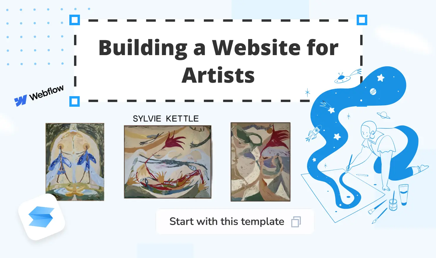
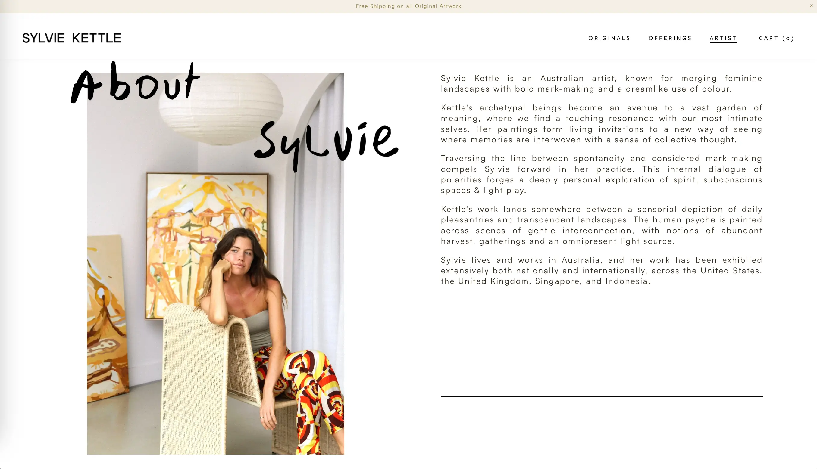
Minimalism is one of the most effective styles for artist websites. The design shouldn’t overshadow the work. White space, monochromatic, restrained typography, and neutral backgrounds are a safe choice. Artists like Sylvie Kettle (opens new window) demonstrate this beautifully: her site uses a calm pastel palette, just clean design, and high-minimalist layout that keeps the focus entirely on her work. The result feels fresh and confident.
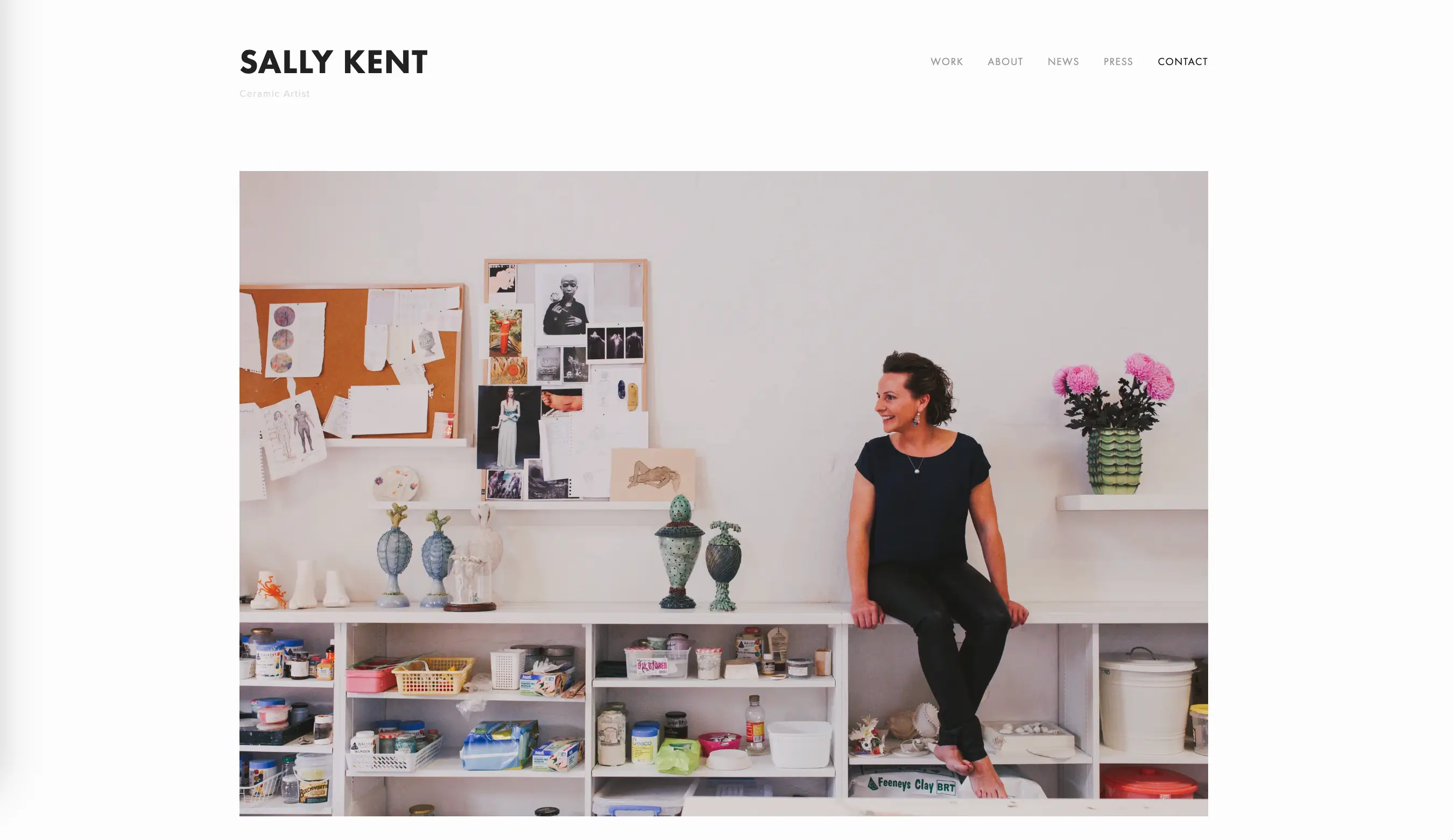
Another strong example in this direction is Sally Kent (opens new window), whose portfolio uses abundant white space and balanced layout, where the main focus is on her vibrant, captivating art. All the necessary information is placed in the navigation bar: Work, About, News, Press, and Contact should be an integral part of a professional website. When building a website remember this rule: simpler presentation often showcases work more powerfully than elaborate effects.
Interactive and Animated Galleries
For digital creators, motion designers, and illustrators, adding interactive elements to a website turns the platform into a presentation of professional skills. When done well, subtle hover effects, smooth page transitions, and animated intros give a site personality without getting in the way. The key word is subtle. Animation should never distract from the art.
Industry-Specific Design Trends
Design trends shift, but a few patterns have proven consistently effective across disciplines:
- Photographers tend to favor visual dominance, dark backgrounds, and minimal text.
- Illustrators often go for bolder color palettes, playful fonts, and layouts that reflect the personality of their work.
- Fine artists and painters frequently use gallery-style grids that recall physical exhibition spaces, sometimes with individual pages for each piece.
- Motion designers and animators lean into video embeds, autoplay reels, and dynamic transitions.
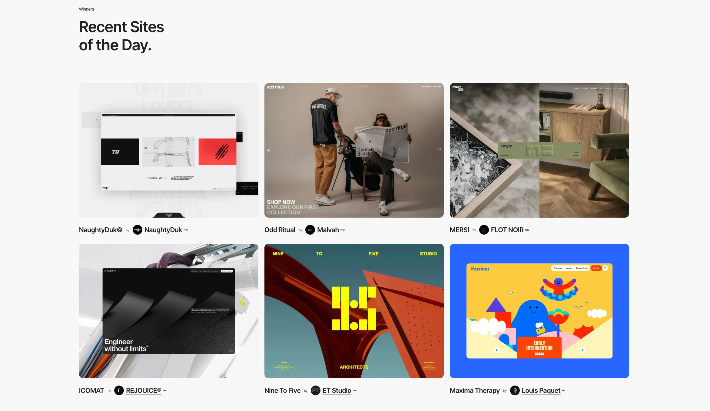
Rather than chasing trends, look at what works in your niche. Browse Awwwards (opens new window) or other similar platforms to see what other artists are doing, and take ideas that fit your aesthetic.
Choosing the Right Platform
Nowadays, you don't need to know how to code to build a professional artist website. No-code website builders evolved rapidly over the past few years, and the options available now are genuinely excellent: they provide all the necessary features and intuitive editing process.
Website Builders for Artists
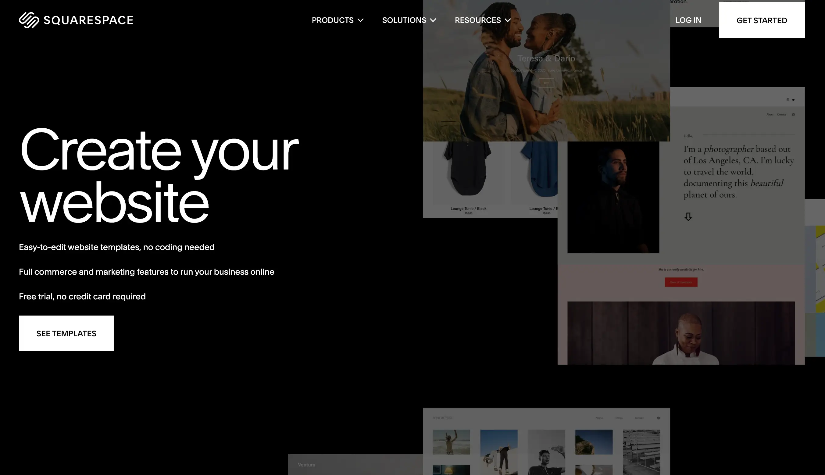
Squarespace (opens new window) is known for its stylish, design-forward templates. It's a great choice for artists who want something beautiful without much customization effort. Templates are well-suited for portfolio use right out of the box.
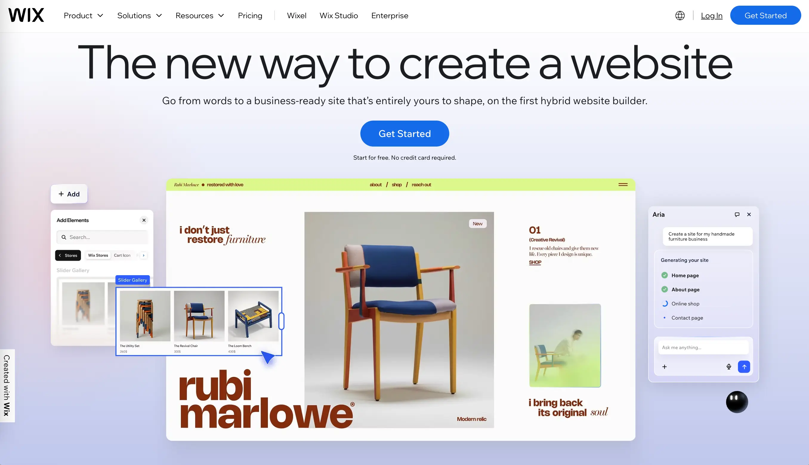
Wix (opens new window) offers drag-and-drop editing, hundreds of templates, and an AI site builder that can generate a layout from a prompt. It's particularly good for creators who want granular control over their design without writing code.
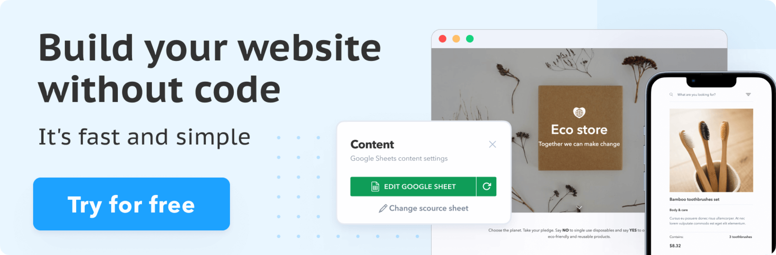
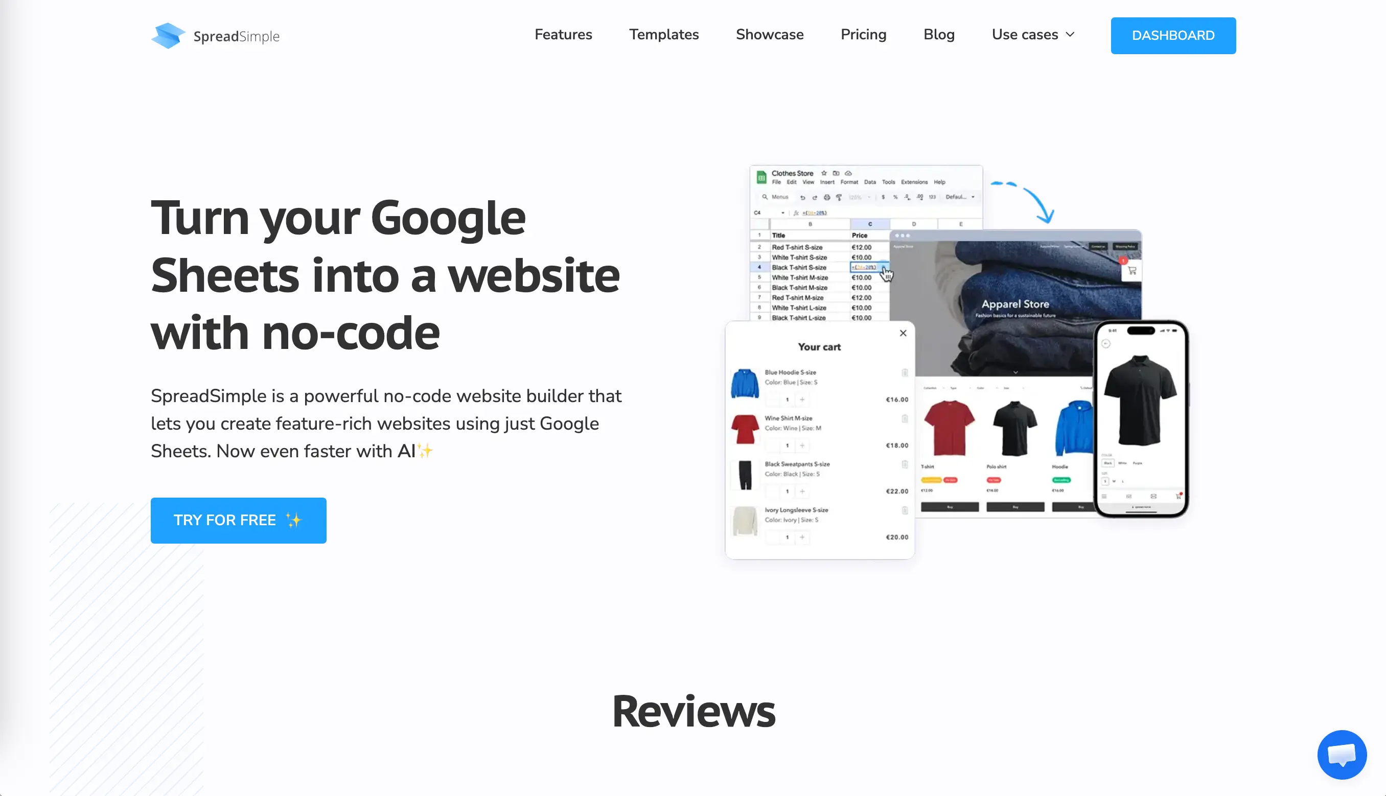
SpreadSimple (opens new window) takes a different approach. It syncs with Google Sheets, which means you can manage your entire portfolio catalog from a spreadsheet. Add a new piece to your sheet, and it appears on your site instantly. It's especially useful for artists who update their work frequently or want to manage inventory, print sales, or commission requests in an organized way. The platform supports dynamic media catalogs, individual item details pages, embedded contact forms, and custom content pages — all without code. Building a site with SpreadSimple takes around 10 minutes.
Webflow (opens new window) is aimed at users who want more design control and are comfortable with a steeper learning curve. It produces beautiful, professional results but takes more time to set up than the others.
Free vs. Paid Options
Most major platforms offer free tiers, but it's worth understanding what's actually included before you commit.
Free plans generally come with:
- Subdomain;
- Platform branding visible on the website;
- Limited storage and bandwidth;
- No access to advanced features like SEO tools, analytics, and payment processing.
Paid plans unlock the custom domain option, remove branding, add advanced SEO features, and many other useful tools and plugins. For most artists, a free plan is good to start, and a basic paid plan is enough to upgrade once everything is clear (typically $10–$25/month depending on the platform and plan).
Custom Domain Considerations
Ideally, your domain is your name or your studio name: something simple, easy to spell, and to remember. If the preferred name is taken, try adding a descriptor. Most website builders let you purchase a domain directly through their platform. You can also buy one separately from a registrar like Namecheap (opens new window) or GoDaddy (opens new window) and connect it to your site. Avoid using hyphens, numbers, or unusual spellings in the domain name. The harder it is to remember, the less useful it is.
Showcasing Different Art Types
Visual Art and Photography
For painters, printmakers, sculptors, and photographers, the quality of images is non-negotiable. A mediocre photo of a great painting will spoil the impression.
Invest in proper photography or scanning of your pieces. Natural light or a controlled studio setup, a neutral background, no distortion, accurate color — these details matter. If the work involves texture or three-dimensionality, consider photographing it from multiple angles.
For photographers specifically, consider organizing work into series or themes rather than showing everything chronologically. Curated collections are easier to navigate.
Digital and Motion Design
Digital artists and motion designers have a natural advantage when it comes to web portfolios: the medium of the website and the medium of the work are in sync. Videos, animations, and interactive projects look captivating and hook the audience.
A few ideas that work well for this type of portfolio:
- Use a short autoplay video reel on the homepage to immediately show what you can do.
- Embed project videos rather than just screenshots — motion work needs to be seen in motion.
- Include process documentation: sketches, iterations, style frames. Clients often find this as valuable as the finished work.
Mixed Media and Installations
Mixed media artists and installation creators face a particular challenge: work that exists physically is hard to represent online. A sculpture, a site-specific installation, or a textile piece loses part of its uniqueness in translation to a flat screen.
To avoid this, use multiple views, close-up detail shots, and images that show scale (a person standing near the work, for example, communicates size in a way a solo product shot cannot). For installations, video walkthroughs can be invaluable.
Don't be afraid to include a short written description alongside documentation. Explain the materials used, the concept behind the work, and the context in which it was shown. That combination of image, video, and text provides an immersive experience.
For inspiration, check out these websites:
Kerryn’s site (opens new window) brings people together through “a shared love of clay, landscape and beautiful objects.”
Marisa Mu (opens new window) mesmerizes with joyful colors of her interdisciplinary creations.
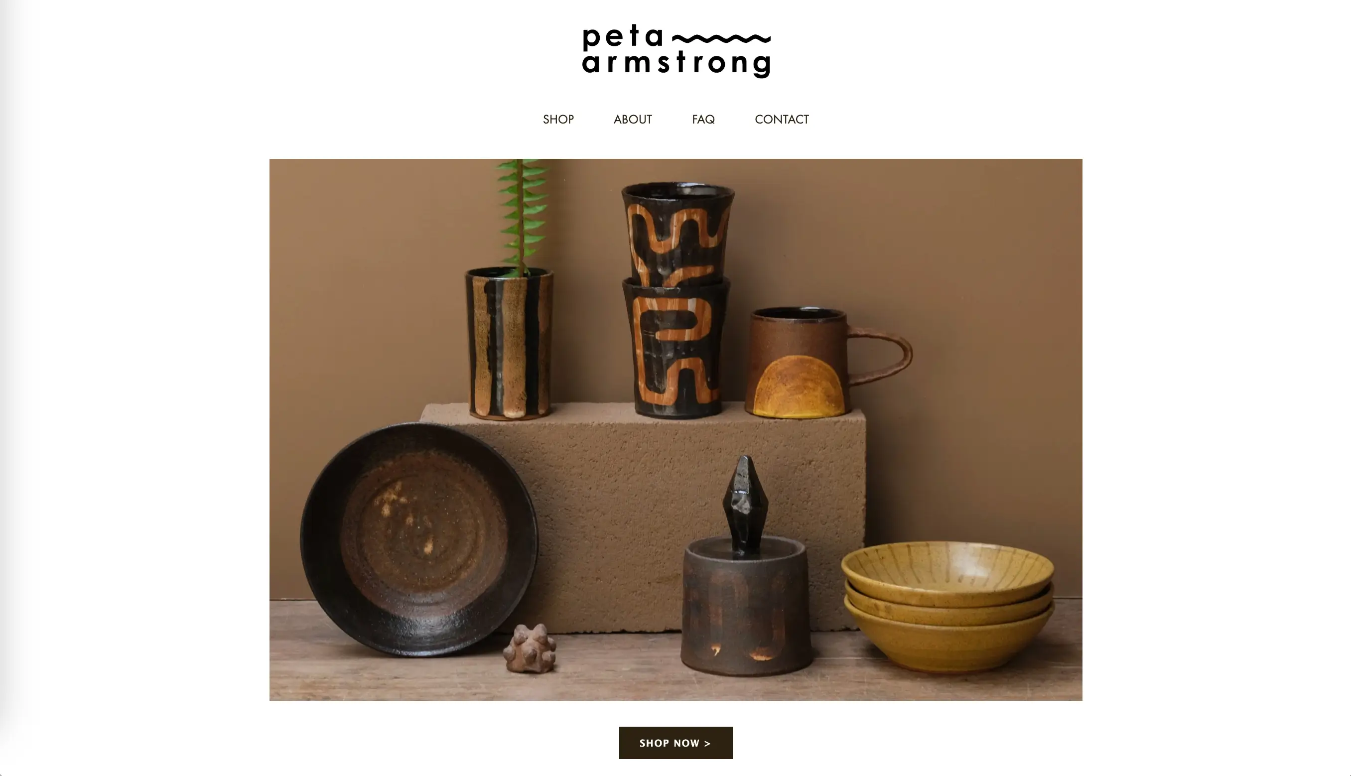
Peta Armstrong (opens new window) inspires by fusing meditation and high fired stoneware ceramics.
Optimizing for Discovery
SEO Basics for Artists
Search engine optimization is essential for any kind of website, including artists’ platforms to make it easy for the right audience to find you online.
Must-have features for artist websites:
- Using real name and the type of work page titles and headings.
- Adding alt text to images.
- Adding text content to the platform. A site with nothing but images is nearly invisible to search engines.
- Making sure the site loads quickly, especially on mobile. Speed is a ranking factor, and it directly affects how long visitors stay.
Organizing a portfolio with well-titled categories helps both with navigation and with ranking for specific search terms that potential clients might use.
Social Media Integration
Add social media buttons to the site so visitors can follow you across platforms. Connect your Instagram feed to the homepage or blog if you update it regularly — it adds fresh content to the site automatically. Make your work easy to share with social sharing buttons on individual portfolio pieces.
The other direction matters too: every social post is an opportunity to drive people back to the website. Add your URL to every bio, include it in captions when relevant, and reference the site in stories or reels that feature your work.
Mobile-Friendly Design
More than half of web traffic now comes from mobile devices, and that number is even higher for social media-driven traffic. Most modern website builders handle mobile responsiveness automatically — layouts adjust to screen size, images resize, navigation collapses into a menu.
Things to test on mobile:
- Does the gallery load quickly?
- Can visitors read the navigation easily?
- Are buttons big enough to tap without accidentally hitting something else?
- Does the contact form work with a phone keyboard?
Common Mistakes to Avoid
Before publishing your first artist website, let’s sum up the most common mistakes to double-check before going live:
- Overcomplicating navigation — When visitors can't figure out where to go, they leave. Keep navigation simple. Four to six items in the main menu is typically enough. Avoid dropdown menus with too many layers. A visitor should be able to understand your site structure within seconds.
- Poor Image Quality — Blurry photos, inconsistent cropping, poor lighting, wrong color balance — these issues tell visitors that the artist isn’t a professional. Compress images but don't sacrifice resolution.
- Missing Contact Information — A contact page buried three clicks deep, no email address listed, a form that doesn't work on mobile — these friction points make potential clients leave the website. Ideally, there should be a link to the contact page in the main navigation.
Conclusion: Building Your Artist Website
An artist website is a professional tool that keeps working for you whether you're in the studio, at an opening, or asleep.
The most important step is the first one: getting something online. It doesn't need to be perfect. It needs to show your work, tell your story, and make it easy to reach you. You can refine and expand it over time.
Start with a platform that matches your workflow. If you update your work frequently and want effortless content management, SpreadSimple's Google Sheets-based approach makes the process almost frictionless. If you want design-forward templates with minimal setup, Squarespace or Wix might be the better fit. For something more complex, Webflow is a good option. Your work deserves to be seen. A well-built website is how you make sure it is!