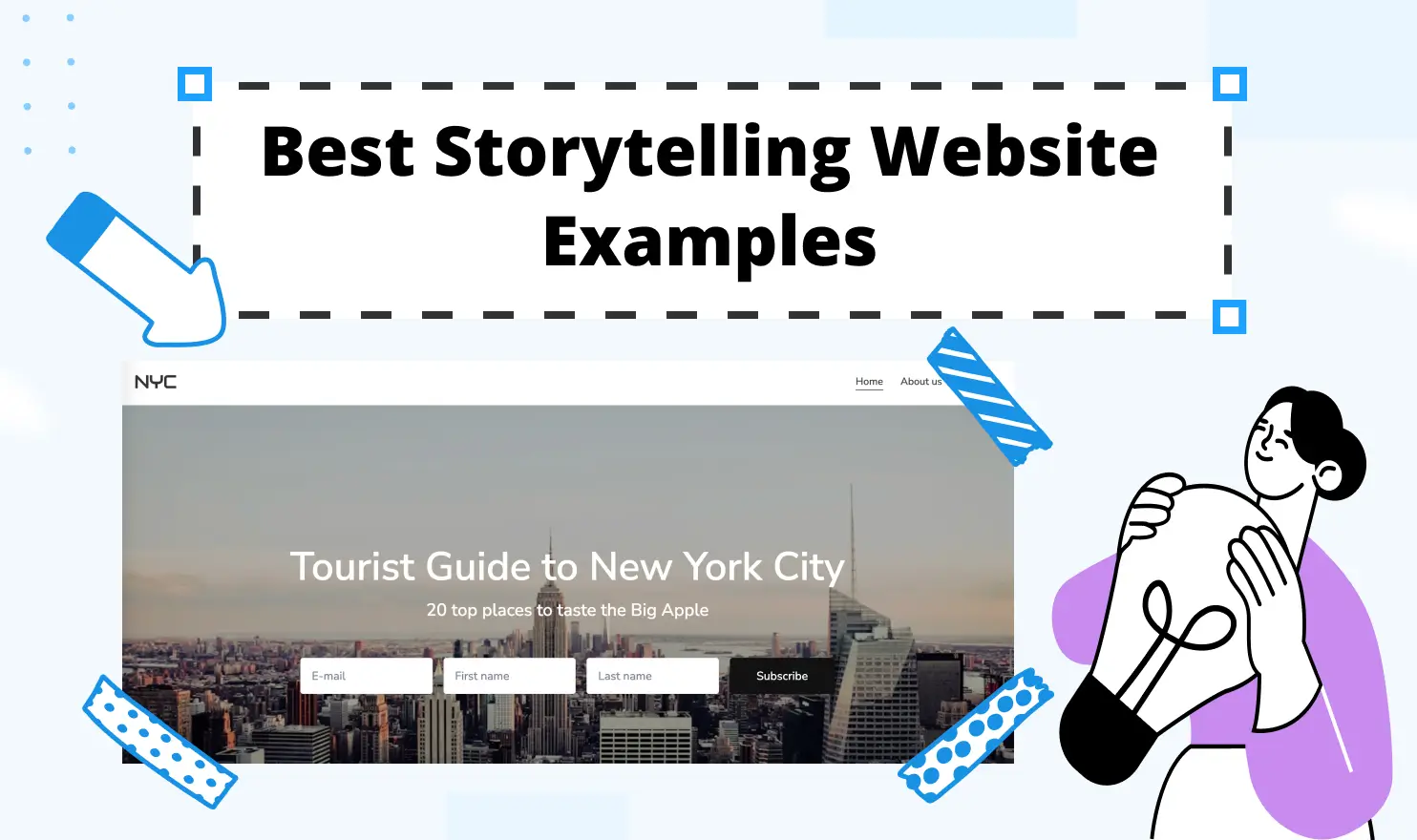
Best Storytelling Website Examples: Web Designs to Inspire Your Next Project
TL;DR: Effective storytelling websites guide visitors through a clear narrative using purposeful visuals, hierarchy, motion, and interactive elements. Borrow the underlying principles from strong examples instead of copying their appearance: establish a beginning, tension, and payoff, then ensure every design choice supports the story and remains usable.
What works like a charm captivating visitors' attention on a modern website? Is there any particular set of SOPs to follow that will help you create and maintain a stunning, functional online platform? This guide walks you through real storytelling website examples, explains what makes each one work, and gives you practical ideas to bring similar thinking into your own web project, with or without a single line of code.
What Makes a Storytelling Website Effective
The Power of Narrative in Web Design
Narrative is one of the oldest and most powerful forms of influence. People interact with each other through communication. Mastering communicative skills is the fastest way to turn your personal vision into a shared reality by turning simple product descriptions into captivating stories, driving readers' attention. A website that taps into it automatically feels different from one that does not.
Narrative in web design means giving visitors a clear sense of beginning, middle, and end. When those elements click into place, people scroll further, keep on reading, and take action without being pushed.
If a website simply presents information as a flat list of facts, people abandon it in no time. Leading companies figured this out years ago. Now even small entrepreneurs use interactive storytelling techniques that were once reserved for film studios and ad agencies with unlimited budgets.
Emotional Connection with Visitors
Emotion is the bridge between a visitor and a decision. People do not buy products, sign up for newsletters, or donate to causes because they ran a logical cost-benefit analysis. They do those things because something resonated. Good storytelling websites create that resonance deliberately, using every available tool: color, motion, typography, photography, and the sequence in which information appears.
A non-profit that shows a photo of real people before showing statistics will almost always outperform one that leads with a graph. A product page that opens with a problem the visitor recognizes has a better impact than the one leading with a product. These structure patterns are grounded in tons of behavioral analytics.
Key Elements of Storytelling Design
Visual Hierarchy and Flow
On a storytelling website, visual hierarchy serves the narrative by controlling where the eye goes. The most emotionally loaded element appears first, next you will spot supporting details. Finally, calls to action will arrive once you start caring about the product or service. Break this sequence and the story falls apart.
Flow is another crucial aspect creating the momentum of the page. When after browsing an endless maze of links, images, blog posts, and videos, a person finally stops with a confidence that this piece is valuable. Good flow comes from consistent spacing, purposeful typography, and a layout that rewards scrolling. Visitors should never feel confused wondering what to look at or where to go.
Scroll-Triggered Animations
Scrolling is how most people navigate the web, but on a storytelling website scrolling becomes an act of participation. Scroll-triggered animations, where elements fade in, slide into place, or transform as the user moves down the page, turn passive browsing into an immersive experience. The visitor becomes an involved spectator watching a captivating story unfold and at the same time controlling its pace.
This is sometimes called “scrollytelling,” which is a hybrid of scrolling and storytelling. You can observe visual effects, such as text fading in section by section or 3D product models that rotate and zoom as you scroll. Either way, the effect is the same: the visitor feels present in the experience rather than observing it from outside.
Interactive Components
Interactive components offer more than just visual flair; they provide a self-directed experience that allows users to engage with the content on their own terms. Hover states revealing additional information, clickable maps zooming into specific regions, and quizzes tailoring the narrative to a visitor’s answers deepen engagement by turning the audience into participants.
When adding any components, always focus on their relevance. Interactive elements should clarify or enrich the story, and not distract from it. A button that does something purely for effect quickly feels annoying.
Best Storytelling Website Examples
Brand Story Pages
1. Inside Chanel
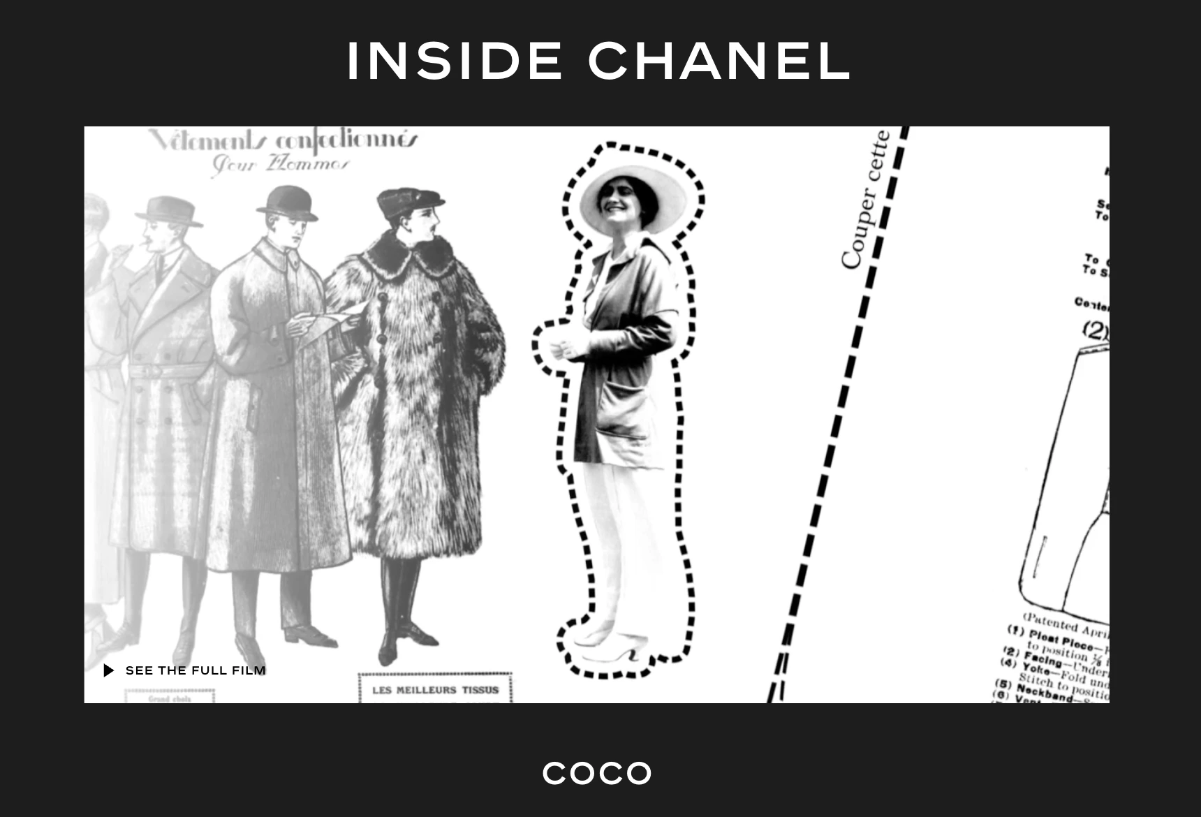
The Inside Chanel (opens new window) project is what happens when a brand commits fully to storytelling as a web design strategy. The project divides the brand’s history into distinct chapters, each with its own visual language, motion graphics, and audio. Visitors can enter any chapter and follow an interactive timeline that mixes archival footage with contemporary photography.
2. Dickies
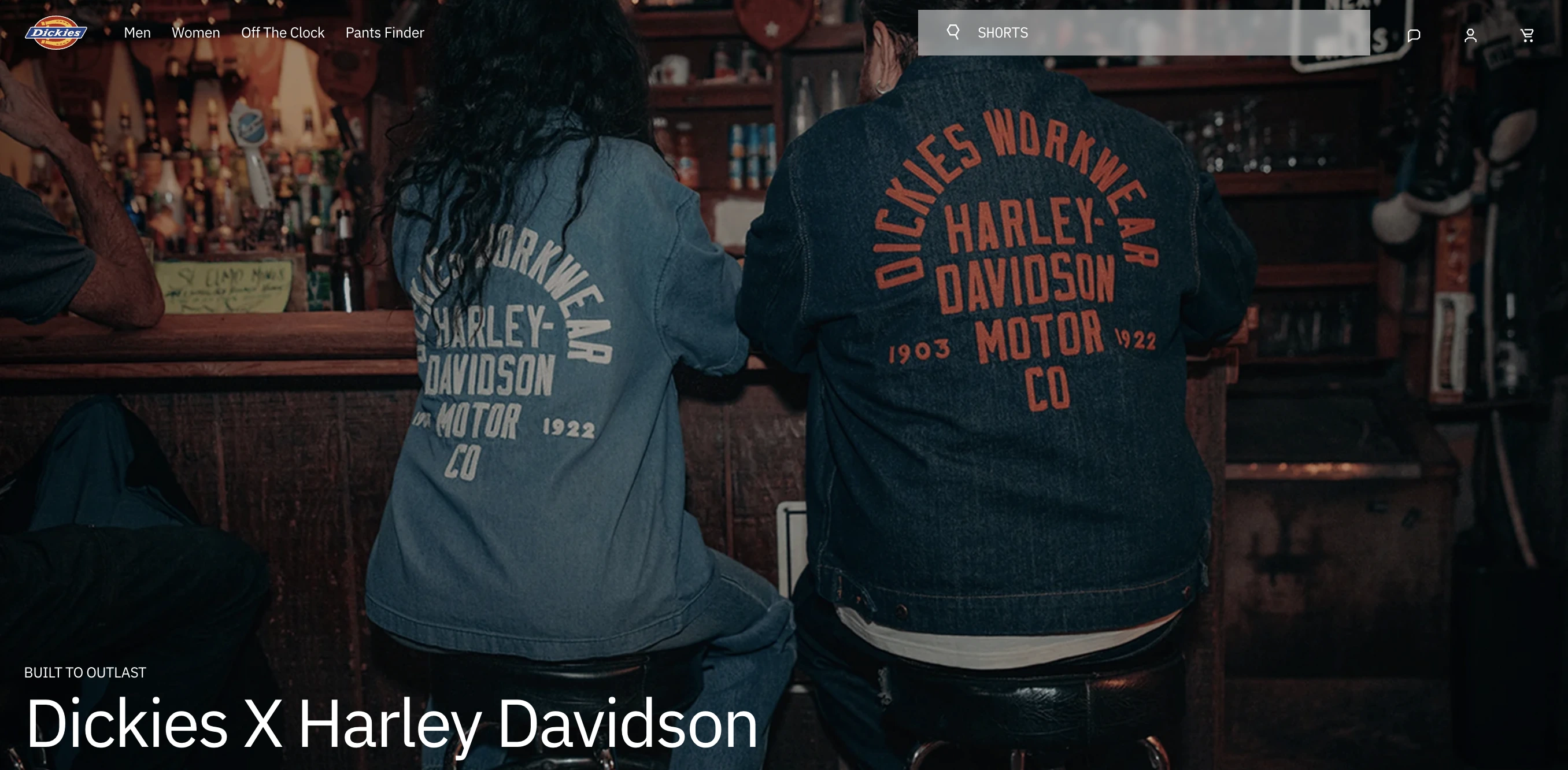
With a simple website layout, Dickies (opens new window) leads with its selling points: the bold title On the job since 1922 builds trust, a nostalgic video with archive footage is both captivating and stylish, and a smart placement of product cards connects the brand’s rich history with an actual opportunity to pitch a sale of a time-tested, reliable clothing item. The customers feel that they are not simply buying a shirt, they become a part of a centennial tradition.
Product Launch Experiences
3. Red Bull Stratos
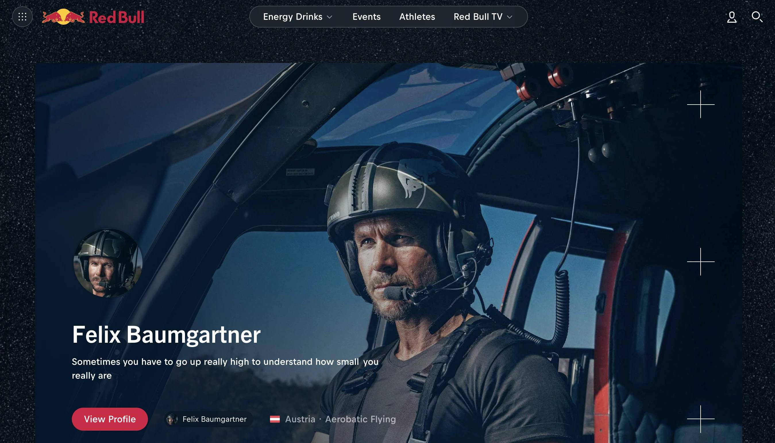
Red Bull (opens new window) is rather a literal example of a launch: Felix Baumgartner’s 2012 stratosphere jump funded by the energy drink has become one of the most spectacular events illustrating the company’s brand identity with the most vivid colors of the universe: bold, daring, and adrenaline-pumped. People could see the event live, creating an unimaginable scale of publicity for the brand.
Non-Profit and Cause-Driven Sites
4. Dharamsala Animal Rescue
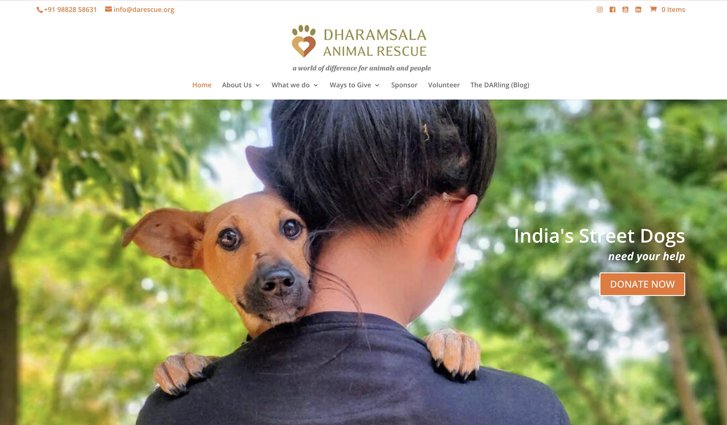
The non-profit organization founded by Deb Jarrett and called Dharamsala Animal Rescue (opens new window) has a strong online presence with a simple yet captivating scrolling story about how they are helping dogs in India: with various projects divided strategically into different sections, every user, who would like to help, can quickly find out how they can be of assistance. With a clearly formulated set of goals and step-by-step explanations on how the team is achieving them, backed by stats, images, and videos, the platform builds trust, compassion, and motivates others to support their cause.
Techniques to Captivate Your Audience
Parallax and Depth Effects
Parallax scrolling is a technique where foreground and background elements move at different speeds as the user scrolls, creating an illusion of depth. When applied carefully, it makes a webpage feel three-dimensional.
Public House (opens new window) is a contemporary gastropub nestled in a scenic Swiss city of Lucerne. The establishment’s website uses parallax in a futuristic way: beautiful images in the background with bold angle-wise typography creating rhythm and catching viewers' attention, drawing it to the main sections: menu, upcoming events, gallery, booking details, and contacts.
Remember: parallax effects can slow page load times and cause accessibility issues for visitors with motion sensitivity. Use them sparingly and always test on older devices before publishing.
Video and Motion Integration
Full-screen video backgrounds and embedded motion clips are among the most effective tools for immediate emotional impact. A well-chosen video does storytelling better than any text.
The practical rules for video on the web are worth knowing:
- Autoplay should be muted by default — browsers often block autoplay with sound.
- Video files need to be compressed for web delivery without visible quality loss.
- The video must serve the brand narrative.
Typography as Narrative Tool
Type size, weight, spacing, and font are essential narrative elements. For example, a large, confident serif headline communicates authority and tradition. A condensed sans-serif in all caps feels urgent and contemporary. Delicate script lettering feels personal and handcrafted.
Scrolling animation applied to typography turns reading into a paced experience. Each word arrives at the moment it is meant to land. Used logically, animated typography can become one of the most elegant storytelling tools available in web design.
Mobile Storytelling Considerations
Responsive Design Challenges
More than half of global web traffic now comes from mobile devices, and a storytelling website can’t look bad on a smartphone. Scroll-triggered animations, multi-column layouts, and large background videos might collapse on a narrow screen. The practical tip is to design for mobile first and then scale up, rather than designing a desktop experience and trying to compress it afterward.
Touch Interactions and Gestures
Apart from scrolling, there are many other available gestures on a smartphone, including swipe, pinch-to-zoom, long-press, etc. The key is to design gestures that are effortless. The visitor shouldn’t wonder what to do. Visual cues make interactive behaviors obvious: a partially visible next card, a dot indicator, a subtle arrow, and more.
Performance on Mobile Devices
Every animation, video, and high-resolution image adds weight to a page. Image compression, lazy loading, and lightweight animation libraries are the standard tools for managing performance. Implement Google's Core Web Vitals scores to get a concrete measure of how a site performs in the real world and optimize it for better user experience.
Tools to Create Storytelling Websites
No-Code Builders with Animation
No-code website builders have developed animation and interaction capabilities that would have required a developer team and a massive budget not long ago.
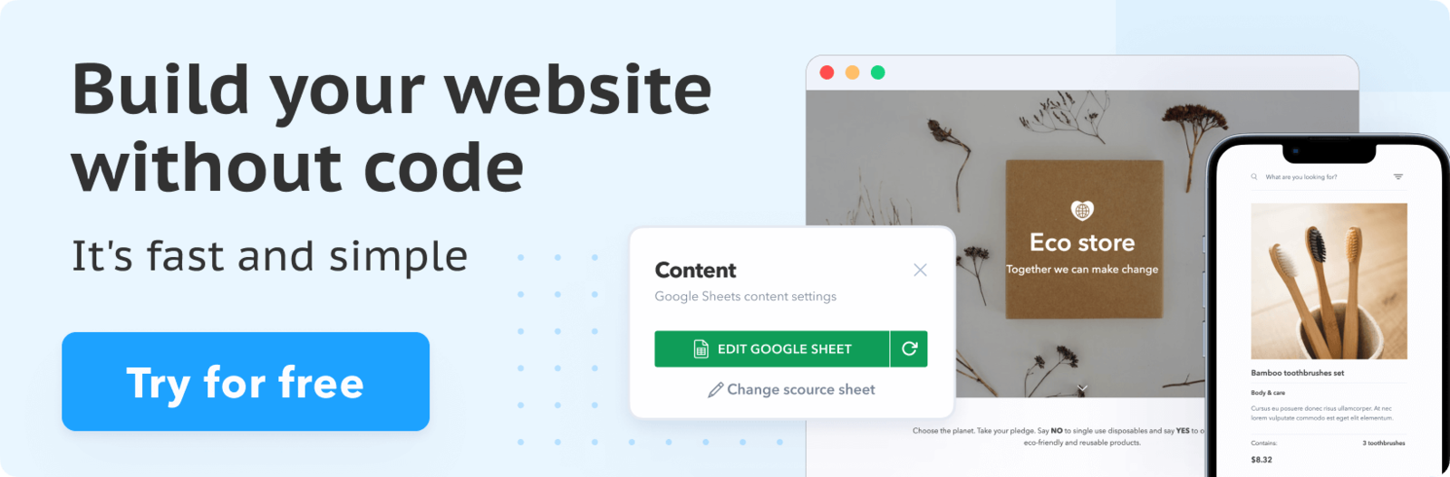
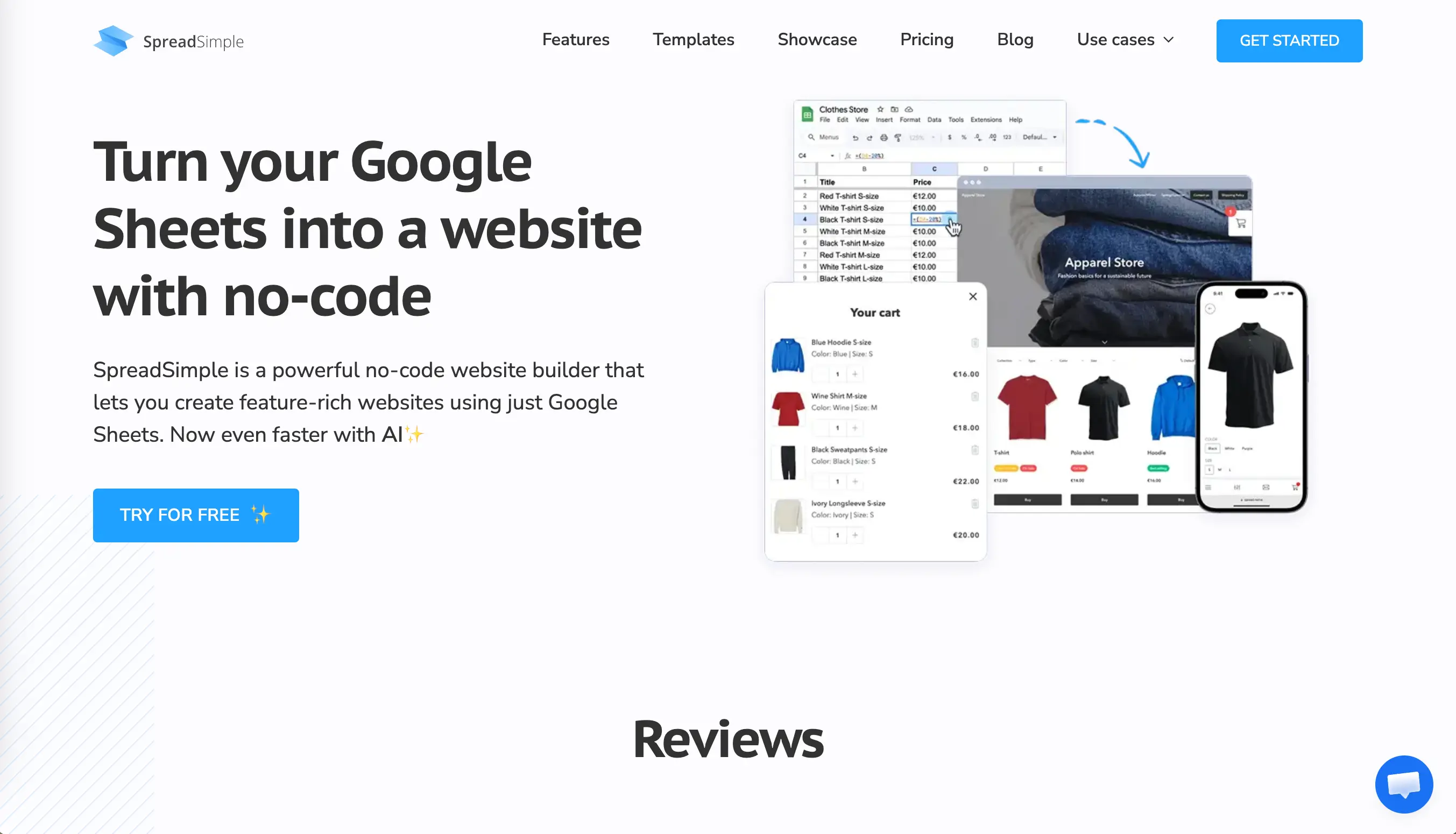
SpreadSimple (opens new window) connects directly to Google Sheets, meaning your content lives in a spreadsheet and syncs automatically to your website. Add a row to your sheet, change a price, update a description, add a new entry: the website reflects it instantly. For anyone managing a site with frequently updated content, this removes the biggest friction point in the storytelling workflow: keeping the story current without constantly logging into a site editor. On SpreadSimple, you can add interactive elements, including images, calendar, videos, and different styles of maps, turning simple scrolling into an immersive experience.
Framer (opens new window) includes built-in scroll animations, hover effects, and transition systems. You can create interactive elements from text descriptions using its AI-assisted layout generator. Webflow offers one of the most sophisticated no-code interaction systems available, with scroll-triggered animations, multi-step transitions, and a CMS for dynamic content. Both platforms are strong choices for designers who want visual control without writing code.
Free Resources and Templates
Starting from a blank page is rarely the most efficient path. Free and premium templates designed specifically for storytelling layouts give you a structural framework to build on. SpreadSimple offers a library of free website templates across categories including e-commerce, directories, and event pages. Each template is connected to a Google Sheet that serves as the content layer, so customizing the story is as simple as editing a spreadsheet. Their free plan is generous and includes 3 websites with SpreadSimple branding and domain, 50 rows spreadsheet limit, but no SEO tools. Other builders like Framer, Webflow, Canva, etc. also include free plans. Before selecting a paid plan, test multiple free solutions to see which features you need in the future.
Design Software Integration
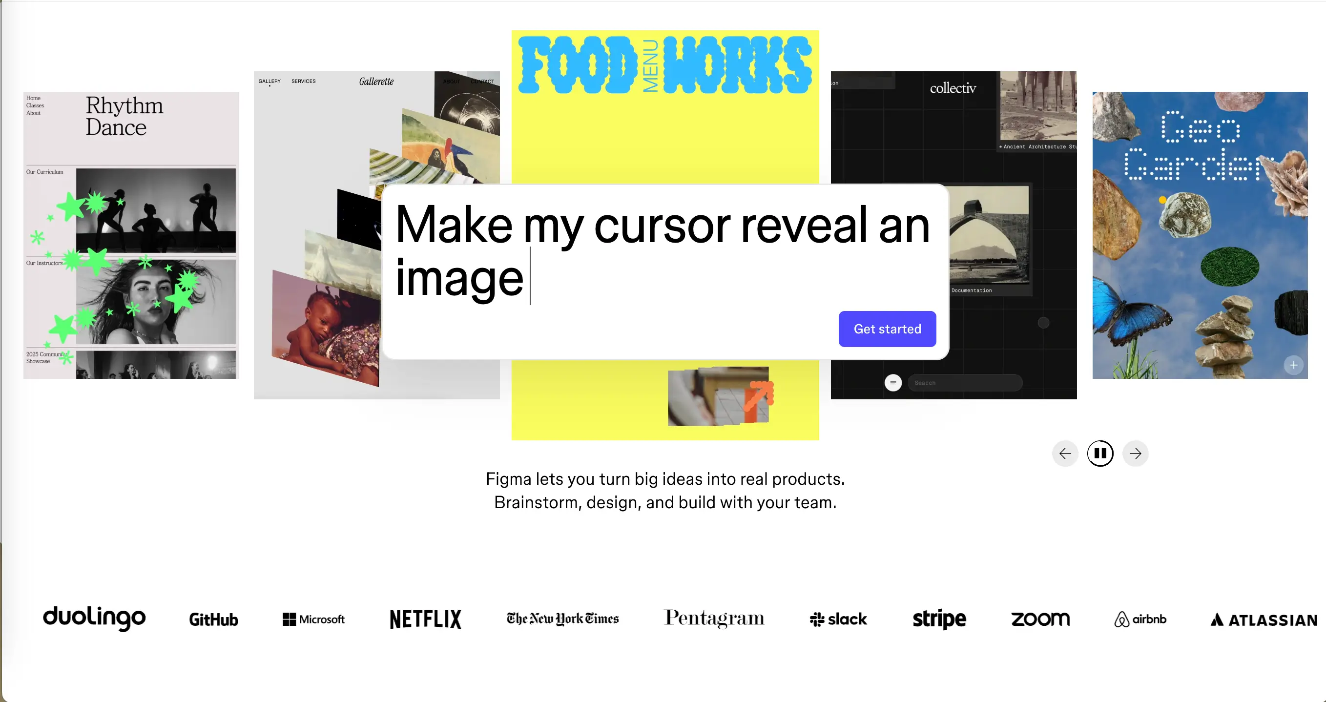
Figma has become the standard starting point for web design, and most major no-code builders now offer some form of Figma integration (opens new window). The practical workflow looks like this: design the visual story in Figma, define the hierarchy and emotional arc, then bring it into a no-code builder to add motion, interactivity, and live content. This separation of design and build keeps each phase focused and makes revisions easier to manage.
Common Mistakes to Avoid
Overloading with Effects
The most common mistake in storytelling web design is using too many effects, causing confusion. Parallax backgrounds, scroll-triggered text animations, cursor-reactive elements, looping video, floating shapes, and color transitions all competing for attention at once do not create an immersive experience, they create chaos.
Poor Navigation and Flow
Even the most immersive single-page experiences need orientation cues. Progress indicators, section markers, subtle arrows, and sticky navigation elements that appear after the user has scrolled past the hero section all help visitors understand where they are in the story without breaking the mood. Navigation and narrative are not opposites. Good design makes them work together.
Ignoring Load Times
A storytelling website that takes seven seconds to load has already lost most of its audience. Research consistently shows that the majority of users abandon a page that takes more than three seconds to display. No scroll animation or cinematic video is worth that trade-off.
Conclusion: Building Your Storytelling Website
To create an effective storytelling experience on your own website, use a clear narrative arc, purposeful visuals, and deliberate implementation of interactive elements. These features will put your site ahead of the overwhelming majority of what is online right now.
If you are starting from scratch or want to add a content-driven storytelling layer to an existing project, a tool like SpreadSimple makes it possible to get a live, functional website up quickly.