TL;DR: Treat 2026 design trends as options, not requirements. Bold typography, dark palettes, whitespace, AI-assisted elements, and richer interactions work only when they strengthen hierarchy, usability, accessibility, and speed. A focused, performance-driven site will serve visitors better than one overloaded with fashionable effects.
Guides with the catchy trends appear every year, but how to define which tendencies will work? So instead of filling this article with a hundred micro-predictions, we focused on the shifts that are genuinely changing how modern websites look and perform in 2026. Whether you're building the first site, updating an existing one, or just trying to stay informed, this guide breaks down the digital innovations to inspire your journey.
Top Web Design Trends to Watch
Current Design Landscape Overview
Not so long ago, all that was needed to make a decent impression online was a homepage and a working contact form. In 2026, people who land on your website have already seen hundreds of other options that day: on phones, laptops, in social feeds. The user's expectations are higher, while attention is shorter, topped with zero tolerance for friction.
Luckily, website-building platforms have become truly powerful and accessible. No-code platforms, AI-assisted design, and smarter templates mean that even small businesses and individual entrepreneurs can create sites without the involvement of a full agency.
The current web design landscape is defined by one central tension: how can a website stand out when almost everything looks superb? The answer usually involves leaning into personality, performance, and genuine usefulness.
What's Shaping Modern Websites
There are several key features driving what people see on modern websites today. One of them is mobile dominance. More than half of all web traffic now comes from smartphones, which means minimized desktop designs will not work anymore. The next one is user experience expectations dictated by apps like Instagram, TikTok, and Spotify, meaning that people expect fast, smooth, and visually engaging interactions everywhere.
The omnipresence of AI is not to be ignored either. These tools are reshaping designers’ work, content personalization, and customer service all together.
Finally, there's a growing tendency for design that is sustainable and accessible. Sites should work for everyone, load efficiently, and don't waste resources.
Visual Design Trends
Dark Mode and Color Schemes
Major platforms like YouTube and X offer the dark mode feature by default, and users got used to it. If a website doesn't support a dark theme in 2026, it can feel slightly outdated, especially in tech and creative milieu.
Deep, rich background colors, carefully chosen accents that pop without disturbing the eyes, and text contrast that passes accessibility guidelines feel premium, convenient, and modern. Many brands in fashion, fintech, and digital products have adopted dark as the primary mode for exactly this reason.
The muted, greige, aesthetic that dominated the early 2020s makes way for vibrant accent colors: electric blues, saturated corals, high-contrast yellows are being used strategically alongside clean neutral bases. The main rule is not to overdo with the brightness and keep the balance.
Bold Typography and Fonts
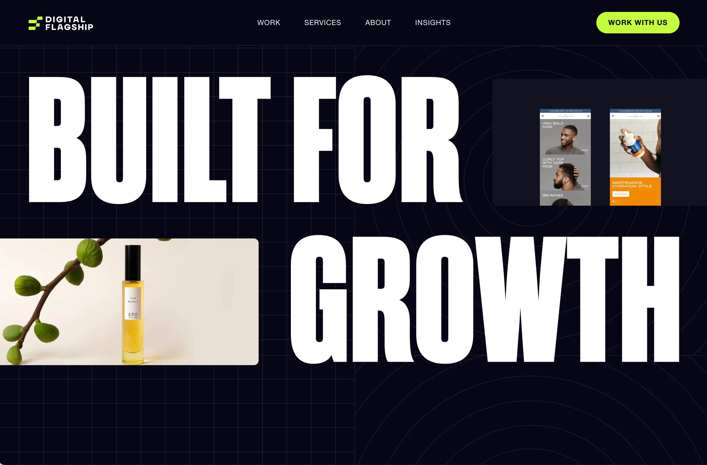
Typography has become an important element on any website. Creators go for oversized headlines, expressive font pairings, and text that functions like a design element rather than just an informative block. Visit almost any award-winning website today, and you'll find a bold, distinctive typographic choice.
The font reflects brand personality like any other detail. Matching various contrasting styles is an innovative approach worth learning about. Kinetic typography is also having a strong moment right now. Text that moves, animates, or responds to scrolling adds personality and keeps visitors engaged.
Whitespace and Minimalism
Like in architecture, minimalism in web design is an intentional choice. To accentuate elements, give them room to breathe by going for generous margins, uncluttered layouts, and clear visual hierarchy.
While referencing Apple’s website (opens new window) might seem banal, do not be too quick to judge. It remains a masterclass in execution that cannot be overlooked. Product images on the site are given space, headlines are short and impactful, and the space doesn’t feel too busy. This approach isn’t just about style and trends, it respects the user's attention, which is invaluable.
In 2026, pure minimalism exists alongside its opposite: maximalism. Fashion, music, and art industry brands often opt for layered layouts, bold color contrasts, dense typography, and deliberate visual noise as a way of expressing personality and breaking from polished corporate norms. Both styles are great, as long as the chosen approach genuinely reflects the brand identity and is centered around the user's comfort.
AI-Powered Design Elements
AI-Generated Content and Images

When considering using AI-generated visuals, creators should remember that these tools shouldn’t compromise the quality and integrity of the product. Nowadays, the excessive reliance on artificial intelligence and the shortcuts it provides can cause distrust and irritation among people. Even giants like Coca-Cola allegedly got in trouble and controversy by releasing fully AI-generated Christmas promotional videos (opens new window). The audience called this work “soulless” and “devoid of any actual creativity.”
AI visuals are cost-effective, but they should be used thoughtfully in order not to lose customer trust.
Personalized User Experiences
Adaptive sites that prioritize user-specific logic are now the prevailing norm. AI-powered personalization can change the order of content, product recommendations, and CTA highlights based on signals like browsing history, location, device type, and referral source.
For small and medium businesses this trend can be achieved without expensive AI tools by using segmented landing pages for different audience types, analytics-driven navigation changes, and thoughtful content that addresses different visitor queries. Even having separate entry points for new vs. existing customers is a form of personalization that can improve results.
Chatbots and Interactive Assistants
Fine-tuned AI-powered chat assistants on websites are proactive, conversational, and often surprisingly useful. They can answer multistep questions, guide users through product selection, handle appointment booking, and show relevant content without the user having to navigate menus. Available around the clock, these helpers never get frustrated and free up the actual team to handle the more complex interactions requiring human involvement.
Note: If chat widgets annoy visitors instead of helping, it creates a major disadvantage.
Interactive and Motion Design
Micro-interactions and Animations
Micro-interactions are the small, satisfying moments that happen when visitors do something on a website: a button that ripples upon a click, a form field that turns green when filled correctly, a menu item that underlines itself as the cursor approaches. Together, they create a sense of polish and responsiveness noticed by users.
Platforms without micro-interactions might feel slightly flat or dated, even if everything else looks fine. Many effects are easy to implement with modern CSS and a little JavaScript. All these additions should never distract the user or delay response.
Scroll-Triggered Effects

Scroll-driven and scroll-triggered animations are now a dominant pattern on high-end websites. As the visitor moves down the page, elements slide in, images swap out, data visualizations build themselves, and narratives unfold. It can create an engaging experience, motivating users to stay on the site and explore it longer.
CHANEL (opens new window) creates a visual symphony out of static product images. The browsing experience feels almost like a fashion show rather than a website.
3D Elements and Depth
Three-dimensional design elements — rotatable product models, depth-layered backgrounds, parallax effects that create the illusion of physical space — have found their way into mainstream website design as browser capabilities have improved.
E-commerce brands are using 3D product viewers to let shoppers examine items from every angle before buying. Real estate sites use 3D floor plans. Creative studios use immersive background environments to set mood.
Complex 3D elements can slow page load significantly, especially on mobile devices. Always test the site on mid-range phones with average internet connections.
Mobile-First Design Priorities
Responsive Layout Best Practices
Mobile-first design is the standard for any modern website. When determining search rankings, Google indexes the mobile version of a site's content first. Designing for desktop and then squishing it down for mobile leads to a mediocre experience.
Modern responsive layouts are built with fluid grids and flexible components that reflow naturally across screen sizes rather than relying on fixed breakpoints and awkward stacking. Tools like CSS Grid and Flexbox have made this much more manageable than it used to be, and no-code platforms have reduced the complexity, making these features accessible to non-technical users.
Touch-Friendly Navigation
A finger on a touchscreen doesn’t work like a mouse cursor. Buttons, links, and form fields need to be large enough to hit without accidentally triggering other elements. Apple's Human Interface Guidelines (opens new window) recommend a minimum touch target size of 44x44 points.
Most people hold their phones one-handed, doing the navigation with their thumb. The comfortable operation area on a standard phone screen is the lower half and center. To improve mobile conversion rates, this is where the most important CTAs should be placed.
Performance on Mobile Devices
Optimizing for mobile performance includes several moments:
- Image compression and specific formats (WebP instead of JPEG);
- Lazy loading (resources below the fold don't load until needed);
- Minimal third-party scripts;
- Efficient fonts;
- Choosing a hosting platform with strong Content Delivery Network coverage.
Many of these optimizations are managed by good no-code website builders. But you should always test the actual site using Google's PageSpeed Insights or Core Web Vitals to analyze its performance.
User Experience Innovations
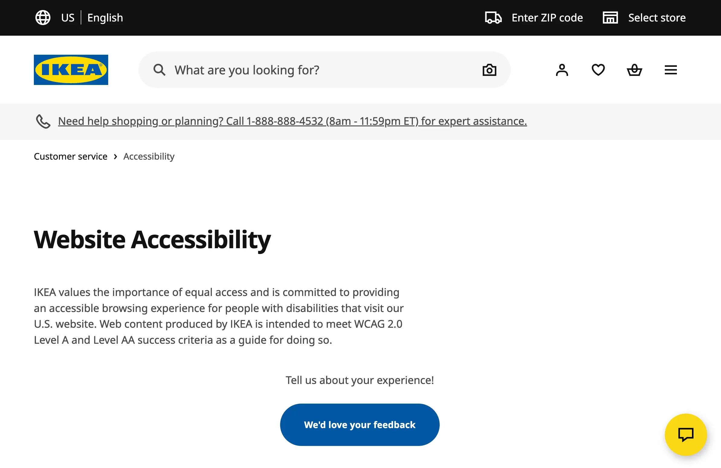
Accessibility and Inclusive Design
Accessibility in web design means building sites that work for everyone: people with visual, hearing, motor, or cognitive disabilities should never feel left out or uncomfortable when using a modern website. Nowadays, there are regulations in the US, EU, and many other regions that require web accessibility compliance. Always add alt text on all meaningful images, captions for videos, develop a logical heading structure and form fields with visible labels.
Fast Loading and Core Web Vitals
Core Web Vitals are a set of metrics that measure real-world user experience around loading, interactivity, and visual stability. They directly influence search rankings, which means slow websites rank lower in search results and get less organic traffic.
The three metrics are:
Largest Contentful Paint (LCP) — it measures how fast the main content loads;
Interaction to Next Paint (INP) — it assesses how responsive the page is to input;
Cumulative Layout Shift (CLS) — it measures how much the page jumps around as it loads.
Clear Navigation Patterns
Navigation isn’t obvious to visitors, unless it’s flawed. Current tendencies lean towards simplicity like a top menu with five to seven clear items and a functional search bar. The modern trend is toward "sticky" navigation that stays visible as users scroll, reducing the friction of needing to scroll back to the top to access a menu. This is especially valuable on long-form pages and mobile experiences.
Inspiration from Popular Websites
Industry-Leading Design Examples
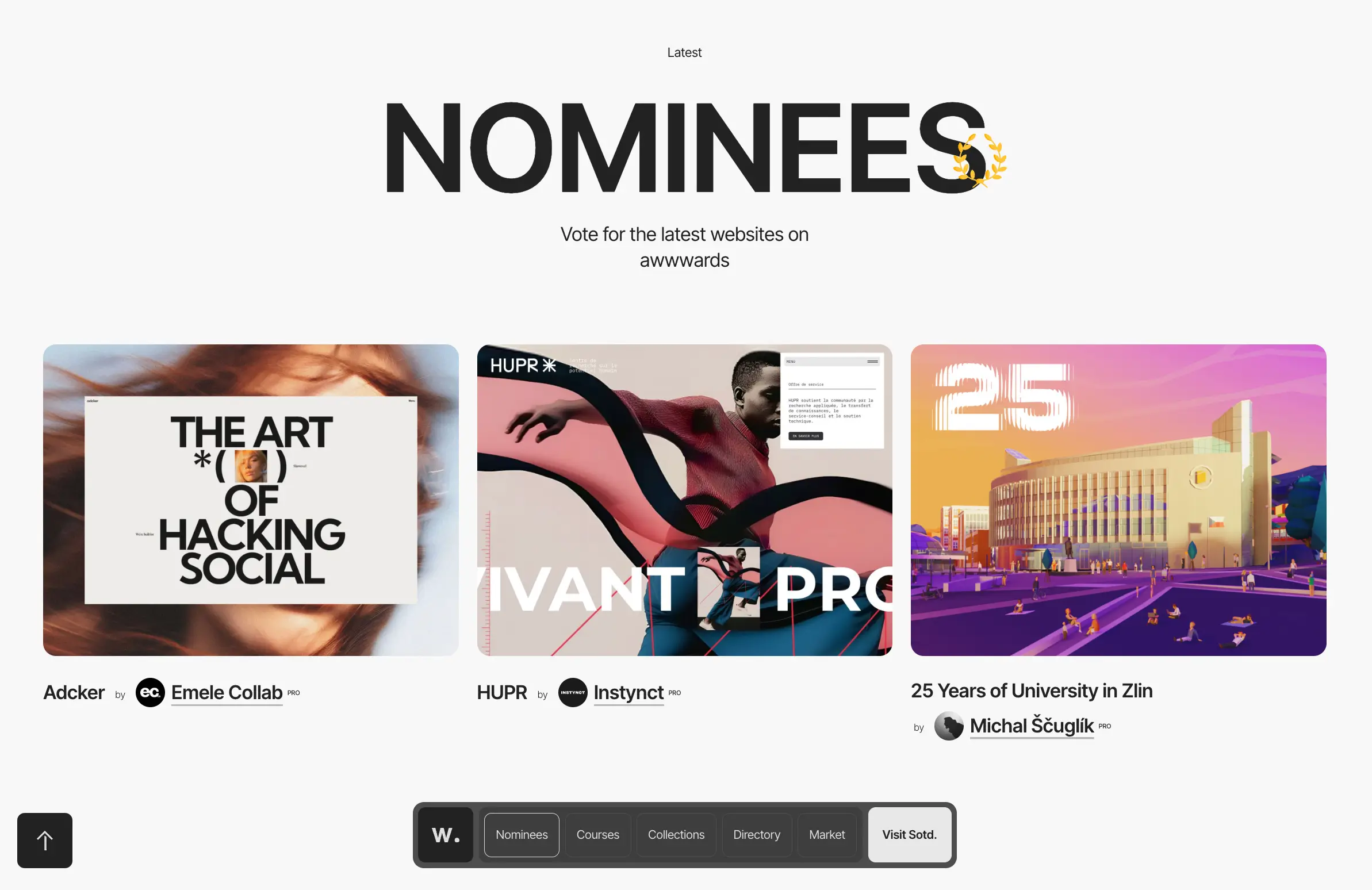
The best place to find web design inspiration is Awwwards (opens new window), which features outstanding websites from around the world. A quick browse through their recent selections can give a clear insight into what really works today.
Looking at leading brands in your niche can also provide valuable information and set you on the right path. When you encounter a website that makes you stop and think "this is good," save it. Note what specifically caught your attention — the color combination, the way the hero section is structured, the font choice, the micro-interaction on the button. Over time, this collection becomes a reference library that informs your design decisions. Here’s our list of websites worth checking out:
- A beautiful, modern artist portfolio by Masayuki Kamimae (opens new window);
- L’Abysse (opens new window) restaurant by Chef Yannick Alléno isn’t just a Michelin-starred gem, but also
- a flawless digital masterpiece;
- Visit Húsavík (opens new window) provides an immersive experience into the Whale Capital of Iceland, with its captivating images, videos, and animations.
- Barcoop Bevy (opens new window) offers a mouthwatering array of natural cocktail mixers, elevated by bright colors and fun animation.
Trends to Adopt or Avoid
Accessibility belongs on every website. But not every other modern tendency should be adopted.
Adopt dark mode support, accessible design, mobile-first layouts, clean navigation with logical information architecture, subtle micro-interactions, and fast load times.
Consider if these fit your brand before adopting bold kinetic typography, 3D elements, and full-screen video backgrounds.
Avoid (unless these trends specifically fit your brand) intentionally harsh aesthetic, over-engineered scroll animations on simple content sites, and chatbots that get in the way.
Conclusion: Implementing Trends in Your Projects
The most important idea to take away from any discussion of design trends is that they are not obligatory. The best websites in 2026 are the ones that focus on performance-driven design rather than on flashy elements.
The web is more competitive and more visually sophisticated than ever. But the tools to build excellent websites have never been more accessible. Try SpreadSimple to create a modern, functional website that stands out.

