TL;DR: A healthcare website should help patients find and access care quickly while establishing trust. Prioritize clear navigation, accessible and mobile-first layouts, fast loading, visible contact details, simple appointment booking, and authentic staff imagery. Organize essential pages around patient needs rather than the healthcare provider’s internal structure.
Why Healthcare Website Design Matters
When someone searches for a doctor, clinic, or medical service online, they're not browsing the web for fun. They're usually stressed, in pain, or worried about a loved one. Within seconds of landing on a healthcare website, they want an answer to the main question: Can I trust these people? That's what makes the platform’s design so different from building a regular business site.
From simply looking professional and being user-friendly, it takes a step further. The site is about making people feel safe, informed, and confident enough to actually reach out and book an appointment. In this guide, we'll walk through everything you need to know: from the core design principles and UX tips to real-world examples and the most common mistakes to avoid.
Building Trust with Patients
Trust is the foundation of every doctor-patient relationship that nowadays starts online. Before calling a clinic, most people will visit its website, read about the doctors’ qualifications, and check reviews. If the site looks outdated, cluttered, or hard to navigate, many visitors will simply come to a conclusion that they won’t get professional help and close the tab.
Good healthcare website design sends a clear signal: We care about your experience, and we take our work seriously. A clean layout, professional photography, clear contact details, and visible credentials are key elements of it. None of these features requires a huge budget. Patients who can easily find accurate information, evaluate the options, and reach the right department are more likely to follow through with the treatment.
First Impressions and Credibility
Usually, it takes a regular visitor seconds to decide whether to stay on a web page or leave. In healthcare, where people looking for help are often already anxious, that time frame is even smaller.
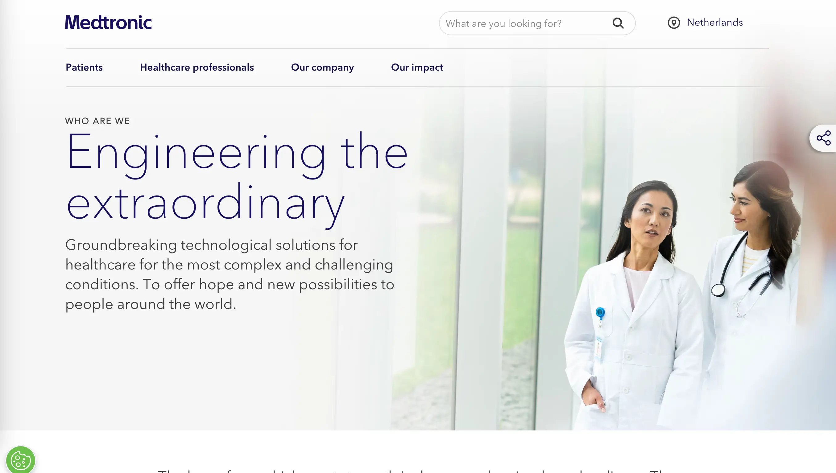
Visual appearance must communicate professionalism and trustworthiness before anyone reads descriptions. Consistent fonts, a subtle color scheme, high-quality images of actual staff members, and an intuitive page structure all contribute to an immediate sense of credibility.
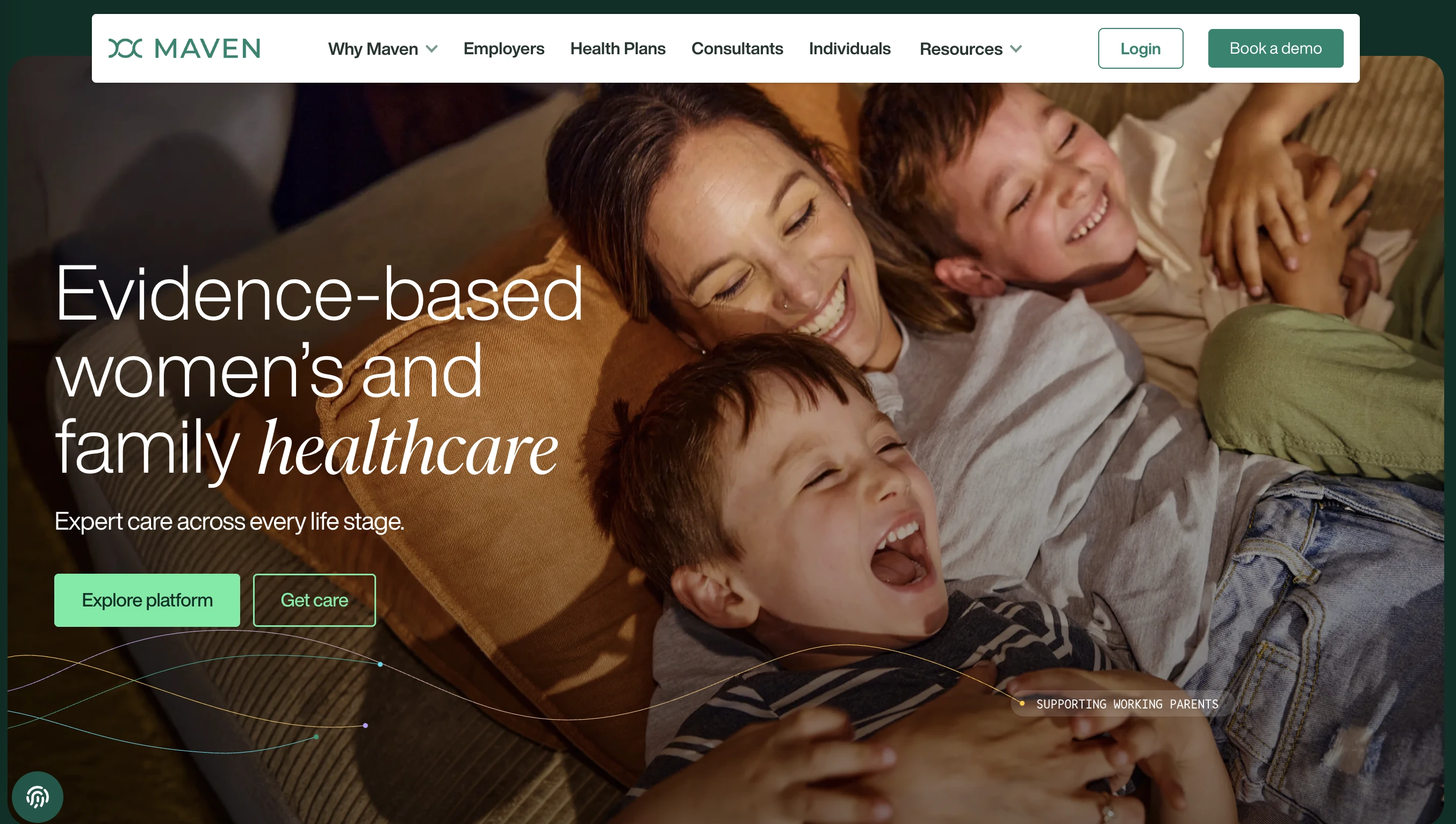
The Maven Clinic (opens new window) website, for example, uses original photos adorned by the pleasant background colors. It creates a warm and welcoming vibe and immediately establishes credibility. The site that feels approachable, which is exactly the right combination for a clinic aiming to reduce patient anxiety triggered by appointments.
Key Elements of Medical Website Design
Clear Navigation and Information Architecture
The key function of a healthcare website is to help people quickly find what they need. This can be achieved by dedicating enough time to develop user-friendly information and structural consistency of your platform.
Good navigation means:
- A clear top-level menu with logical categories (Services, Doctors, Reviews, Contact);
- A functional search bar;
- Maximum three clicks to reach any important page;
- Sticky navigation that stays visible as users scroll.
Quick tip: map out your users' most common pathways before designing the navigation. For a general practice clinic, those journeys might be: "book an appointment," "find a specific doctor," "get directions," and "check opening hours." Make sure each of those paths is obvious and short.
Accessible Design for All Users
Healthcare serves everyone, including people with disabilities, older citizens, and those with limited tech experience. Accessible web design isn't just a legal requirement in this field. It's the right thing to do, often improving the experience for everyone.
Accessibility in web design means making sure your site works for people with visual, auditory, motor, or cognitive impairments. In practice, this translates to things like: sufficient color contrast between text and background, adding alt text for images, keyboard navigability, and avoiding autoplay videos with audio.
Mobile-First Approach
In the modern reality, more than 60% of web traffic comes from mobile devices, and healthcare is no exception. Patients search for clinics while waiting for the bus, look up symptoms in the middle of the night, and try to book appointments from their phones.
A mobile-first design approach means starting the design process with these use cases in mind. The result is a layout that prioritizes the content that matters most, with large tap targets, fast load speeds, and text that's readable on a small screen.
Specific medical website tips for mobile:
- Make phone numbers tappable (so users can call with one tap);
- Keep forms short and easy to fill on small keyboards;
- Don't hide data such as addresses or opening hours behind multiple clicks.
Essential Pages for Healthcare Websites
Homepage Best Practices
A homepage is the storefront of your medical practice. It needs to do a lot of work in a small amount of space: communicate who you are, what you do, where you are, and why patients should choose you, all without overwhelming visitors with too much text.
The best healthcare homepages typically include:
- A clear headline that names the specialty or service;
- A visible, responsive CTA button;
- A short summary of the key services offered;
- Brief doctor or team introductions with real photos;
- Trust signals: years in practice, certifications, patient reviews;
- Easy access to contact information or location.
Do not put everything on the homepage. Its task is to guide visitors deeper into the site, not to explain every service in detail.
Services and Specialties Pages
Service pages should be specific and informative. For example, for a dental clinic, don't just list "Dental Services." Add individual pages for dental cleaning, implants, orthodontics, dental sealants, crowns, emergency care, etc. Each page should explain what the service involves, who it's for, what patients can expect, and how to book.
This structure isn't just good for UX, it's good SEO. Search engines prioritize pages that address a specific topic clearly and thoroughly, so well-structured service pages will help patients find you in the first place.
Doctor Profiles and About Us
Doctor profile pages are among the most visited sections on any healthcare website. A strong doctor profile typically includes a professional headshot, full name and credentials, specialty and areas of expertise, education and training history, and a brief personal bio that gives a sense of personality.
The "About Us" page is a chance to tell the organization's story: how it was founded and what its core values are. A genuinely written page that reflects the real culture of your practice will do more for trust than a generic AI-generated mission statement.
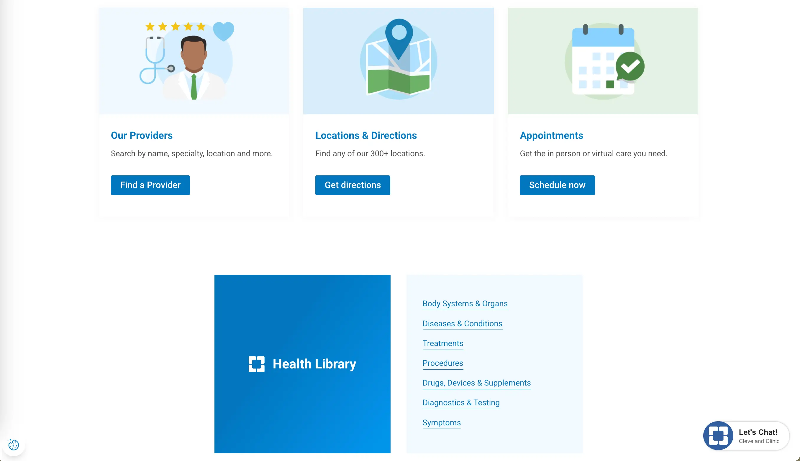
Contact and Appointment Booking
Having to work hard to figure out how to contact the place causes people to abandon their efforts. Contact information should be easy to find from any page on the site: typically in the header and footer at minimum.
Online appointment booking is a must-have feature. Patients expect to be able to schedule appointments without making a phone call, especially when it comes to non-urgent matters.
A few things to include on your contact page: phone number (clickable on mobile), physical address with an embedded map, a contact form with clear fields, office hours, and any after-hours or emergency instructions.
Design Inspiration and Examples
Modern Healthcare Website Trends
Healthcare web design has evolved significantly in recent years. The white-heavy aesthetic that dominated medical websites for decades has given way to a warmer, more human, and more design-forward approach. Let’s take a look at some trends worth drawing inspiration from:
- Soft, organic shapes. Curved sections, blob shapes, and rounded elements soften the look of a site and make it feel less clinical.
- Bold, unconventional color. While blue remains a staple, many forward-thinking healthcare brands are now using greens, purples, warm neutrals, and even dark themes. Biostrata (opens new window), a life science marketing company, uses a dark theme with a gray palette that feels sophisticated and at the same time accessible.
- Animated product demos. For digital health platforms and healthcare software, showing the product in action through subtle animations has become a standard. Labguru (opens new window), for example, uses animated demonstrations that show exactly how the platform works.
- Authentic photography. Stock photos of models smiling at cameras have become a cliché. Only real photos of team members, actual facilities, and real patient interactions (with consent) can create credibility.
Color Psychology in Medical Design
Colors are one of the most powerful tools in design, and the right choice of palette has a crucial role in how visitors perceive your healthcare brand. Getting the shades right helps manage patient emotions before they've read a single word of copy.
Blue is the most universally trusted color. It remains the backbone of many medical websites. It's calming, reliable, and associated with professionalism. Lighter blues feel clean, deeper navy tones convey authority.
Green is associated with health, vitality, and nature. It works particularly well for wellness-oriented practices, pediatrics, and integrative medicine.
White and light gray convey cleanliness and clarity. When used as the dominant background color with strategic pops of a brand color, this palette is effective and timeless.
Avoid aggressive shades of red as a primary color (they trigger urgency and alarm), muddy color combinations that feel confusing, and overly dark themes for patient-facing sites. The latter is a better fit for B2B healthcare technology companies.
Typography and Readability
The online platform's typography has a direct impact on whether visitors actually read it or just take a superficial look and leave. In healthcare, where visitors may be reading about complex medical conditions or procedures, clear and readable text is even more critical than in other industries.
Practical ideas on typography for medical websites:
- Use a sans-serif font for body text. It's easier to read on screens, especially at smaller sizes.
- Keep body text at 16px or larger. Many healthcare visitors include older adults who may struggle with small text.
- Maintain a line height of around 1.5 – 1.6 for paragraphs. This gives the text room to breathe.
- Limit your font choices to two. One for headings, one for body text. More than that feels chaotic.
- Avoid light gray text on white backgrounds. The contrast may feel sleek, but it fails accessibility standards.
User Experience Considerations
Fast Load Times and Performance
Site speed matters for any online platform, but in healthcare it can literally determine whether someone gets the help they need. A patient searching for an urgent care clinic or trying to reach a pharmacy in a hurry will not wait for a mediocre website to load. Slow load times also hurt search rankings, which means fewer people get to discover the platform in the first place.
Compress images before uploading, use a fast and reliable hosting provider, reduce unnecessary plugins, and enable browser caching to speed up the site.
Build your platform using a no-code builder (opens new window) like SpreadSimple rather than going for a custom-coded solution from scratch. Modern website builders are highly optimized for performance and require no technical maintenance.
Clear Call-to-Action Placement
Every web page should make it absolutely obvious what the visitor should do next. This is called a call-to-action (CTA), and its placement, wording, and design all matter.
The primary CTA on most medical websites is some version of "Book an Appointment" or "Contact Us." This button should be visible without scrolling and repeated at logical points throughout service and doctor pages, and use a color that contrasts the surrounding content. Make sure the button links to a functioning page or form.
Patient Portal Integration
If your company uses a patient portal (a secure online platform where users can view test results, manage prescriptions, or message their care team) make sure it's prominently linked from your main platform.
Many clinics bury the portal link in a small footer navigation item, which means patients have to search for something they use regularly. A prominent "Patient Login" button in the header significantly improves the user experience.
When designing around the portal, also make sure first-time users can easily figure out how to register. A short explainer or FAQ about the portal on the website can prevent a lot of frustration.
Compliance and Security
HIPAA and Data Privacy
In the United States, any healthcare provider that collects, stores, or transmits patient health information must comply with HIPAA (the Health Insurance Portability and Accountability Act). Violations can result in significant fines, so this is not a topic to avoid.
For a medical online platform, HIPAA compliance means being careful about how its owners collect user data through contact forms, appointment booking systems, and portals. Standard web forms that submit data over unencrypted connections are not HIPAA-compliant for medical information. Use encrypted, secure form solutions and ensure that any third-party add-ons are HIPAA-compliant as well.
SSL Certificates and Security Badges
The small padlock icon in the browser's address bar, indicating an SSL certificate is active, and the connection is encrypted, has become a basic user expectation. Any healthcare website without HTTPS will receive browser warnings, which will immediately undermine patient trust.
Beyond the technical requirement, visibly displaying security information can reassure visitors. If your practice is accredited, has passed specific security certifications, or uses a well-known and trusted patient portal system, consider displaying those badges on appropriate pages of your site.
Accessibility Standards (WCAG)
The Web Content Accessibility Guidelines (WCAG) provide a framework for making websites usable by people with disabilities. Meeting WCAG 2.1 Level AA is the generally accepted standard for medical organizations, and in many jurisdictions, it's a legal requirement under disability discrimination legislation.
WCAG compliance is about providing text alternatives for non-text content, ensuring sufficient color contrast, making all functionality available via keyboard, not relying solely on color to convey information, and ensuring that time-based media has captions. Regularly check your website using tools like WAVE and Google Lighthouse.
Common Mistakes to Avoid
Overcomplicated Navigation
One of the major problems with healthcare platforms is a navigation menu that has grown organically over the years into a confusing maze of dropdowns, sub-menus, and redundant pages. To avoid this, audit your navigation from a fresh perspective, ask real users to complete common tasks on your site and get their feedback. You'll quickly identify where people get stuck or confused.
Missing Contact Information
It sounds obvious, but a surprising number of sites bury or omit key contact information. Missing phone numbers, outdated addresses, and no clear instructions about what to do in an emergency are all real problems that not only frustrate patients but can create safety issues.
Check the presence of the right phone number and address on every page, embed a map, and clearly visible opening hours. If your company has multiple locations, make sure each of them has its own page with specific contact details.
Poor Mobile Experience
Like we’ve already mentioned above, a medical website that looks great on a desktop but isn’t functioning correctly on a phone will lose the majority of its potential patients. The most common mobile problems:
- Text is too small for comfortable reading;
- Buttons are too close together;
- Forms are cumbersome to fill in on a phone keyboard;
- Pop-ups cover the entire screen without a clear close button.
When redesigning a platform, test every page on multiple devices at every stage of the process.
Conclusion: Building an Effective Healthcare Website
A great healthcare website architecture includes all the logical features that any online platform developed with its users in mind has. In this case, the goal is to help patients get the care they need efficiently, in no time. Clear navigation, trustworthy design, real photos of real people, fast loading, easy booking, and visible contact information are basics that should be applied with care and consistency.