TL;DR: A squeeze page is a distraction-free landing page that collects contact details in exchange for an offer. Build it around a useful lead magnet, benefit-led headline, short form, clear CTA, mobile-friendly design, and trust signal. Connect it to email marketing, then improve one element at a time through A/B testing.
You put in weeks of work on your brand: set up ads, posted captivating images, and wrote SEO-focused product descriptions. Next comes a bitter reality with zero ROI. People click through, look around, and disappear. No email, no contact, no way to follow up. This is exactly the problem a squeeze page solves. It is one of the most focused tools in online marketing.
In this guide, we break down what a squeeze page is, what makes it work, and how to build one that actually works.
What Is a Squeeze Page?
Definition and Core Purpose
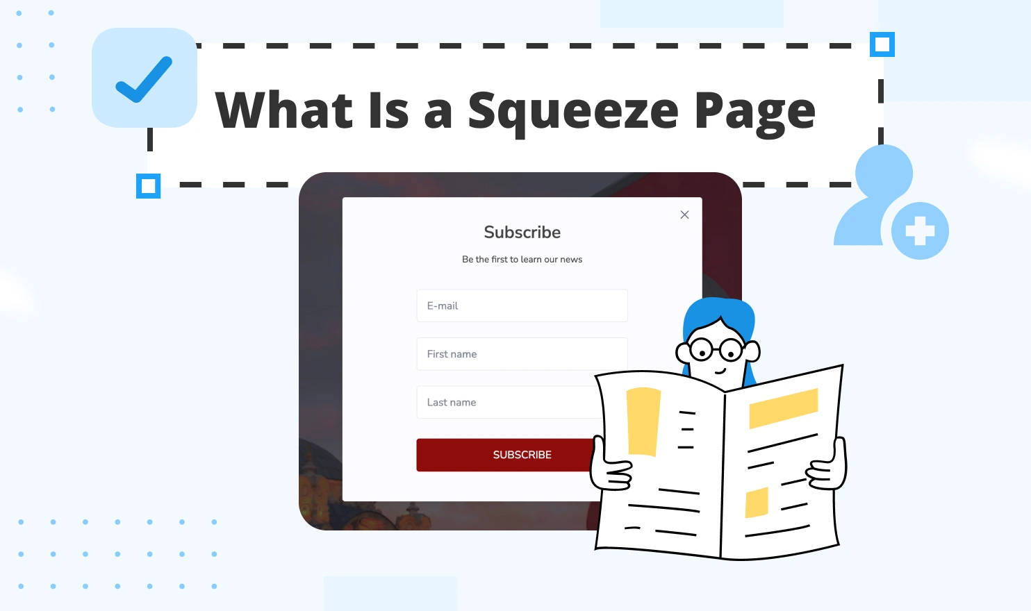
A squeeze page is a type of specialized one-page website built for collecting a visitor's contact information, most commonly their email address, in exchange for something valuable. It can be a free guide, a product discount, a mini-course, a checklist, or any other valuable offer.
A well-designed squeeze page turns anonymous web traffic into a list of potential customers you can contact. And that email list? It is one of the most valuable assets any online business can have.
How It Differs from Landing Pages
People often interchange "squeeze page" and "landing page". They are related, but not identical.
A landing page is a broad category. It covers any standalone web page designed to convert visitors for a specific goal: a sale, a sign-up, a webinar registration, a free trial, etc. Landing pages sometimes include navigation, multiple CTAs, product details, testimonials, and pricing tables.
A squeeze page is a specific type of landing page with one purpose: it only collects contact information, and the entire page is designed to make that one action effortless, without any distractions.
When to Use a Squeeze Page
Not every campaign needs a squeeze page. Here are the cases where this format delivers peak utility:
- To capture leads before people bounce when running paid ads (Google, Facebook, Instagram);
- When launching a free resource designed to attract target audience;
- When building an email list from scratch or growing an existing one;
- When hosting a webinar or online event with required registrations;
- When selling a course, coaching program, or digital product;
- When running a promotion and collecting subscribers before the offer goes live.
If the ultimate goal is to get someone's email address in exchange for value, a squeeze page is the best tool for you.
Key Elements of Effective Squeeze Pages
Compelling Headline and Copy
A headline is the first thing a visitor sees. It should be strong enough to capture attention in under three seconds by highlighting a clear benefit or a specific problem. Make sure it is not a vague, generic phrase like "Subscribe to Our Newsletter."
The copy that follows the headline should be brief, focused, and written in plain language. Tell visitors exactly what they will get, why it matters to them, and what happens after they click in three to five bullet points or two short paragraphs.
Lead Magnet Examples
A lead magnet is a free high-value asset a business exchanges for someone's email. The reason must be compelling enough for visitors to share their contact details. The best lead magnets are niche-specific and immediately useful. Here are some of the most reliable formats for different industries:
- PDF checklist or quick-start guide (great for educational content);
- Free mini-course or email sequence (excellent for coaches, educators, and consultants);
- Discount code or early access offer (works very well for e-commerce);
- Free template, swipe file, or toolkit (popular in marketing, design, and productivity niches);
- Webinar or workshop registration (ideal for higher-ticket offers);
- Free chapter or sample from a book or course (perfect for content creators and authors);
- Quiz or assessment result (highly engaging and interactive).
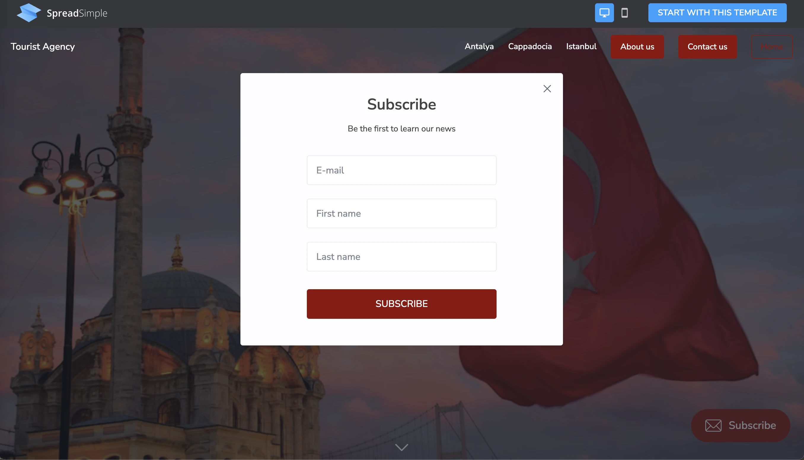
Opt-in Form Design
The opt-in form design encourages visitors to take part in a marketing activity presented by your business. It is one of the most efficient ways to boost conversion rate. Usually, it includes an email and name submission request. Try not to overload it with unnecessary questions. Otherwise, users might end up abandoning the form. Place the form above the fold whenever possible so that the visitor could see the headline, the offer, and the form without scrolling.
Call-to-Action Best Practices
In marketing and sales, you can’t underestimate the power of the CTA button. It is the last nudge between a visitor thinking about it and actually submitting their email. Do not simply add a lazy, impersonal wording like "Submit."
Try coming up with an actionable button text from the reader's perspective:
- "Send Me the Free Guide"
- "Yes, I Want the Templates"
- "Grab My Discount"
- "Get Instant Access"
- "Start the Free Mini-Course"
The button color matters too. Use a contrasting shade to make it stand out. It creates an accent, a visual pull drawing visitor’s attention to the right spot.
To find out more about the color function in web design, check out our previous blog post about the latest web design trends (opens new window).
Squeeze Page Design Principles
Minimalist Layout Approach
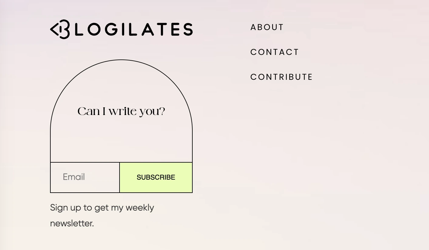
A squeeze page overloaded with information turns into a regular web page. The whole point is focused attention, so the design should be minimalist. That means no navigation menu at the top, no sidebar, or "Related Articles" section. Stick to these components: the headline, the offer, the form, and the CTA. For a professional and trustworthy layout, make sure there is enough white space and no clutter reducing the readability.
Visual Hierarchy and Focus
Visual hierarchy means guiding the visitor's eye in a deliberate path: from the headline to the offer description to the form to the button. Every design decision should support this idea.
To help highlight the importance, use different font sizes. As a rule, the headline is the biggest text on the page. As we’ve already mentioned above, color contrasts help make the CTA button stand out. Directional cues, like an arrow, subconsciously point people toward the opt-in.
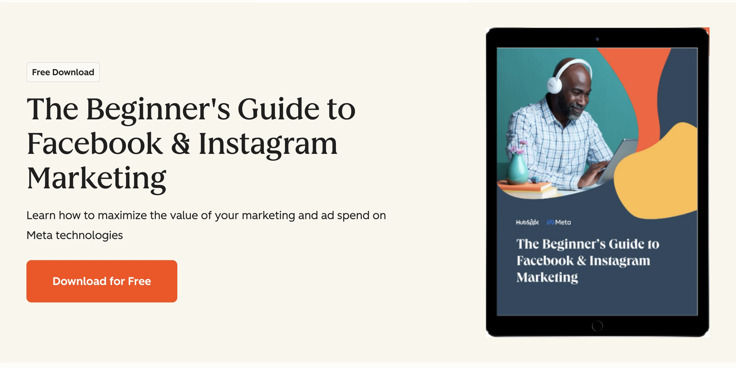
Place a product image near the form to accentuate that the offer is tangible and real, which increases perceived value and click-throughs.
Mobile Optimization
The fact that nowadays more than half of all web traffic comes from mobile devices is not a surprise to anyone. Therefore, a squeeze page must look great on a phone.
- In this case, mobile optimization means:
- The font is large enough to read without zooming;
- The form fields are easy to tap;
- The CTA button is big enough for a thumb;
- No horizontal scrolling.
Always test your page on an actual phone, instead of taking a glance at a browser resize preview. Page speed matters on mobile as well. Heavy images, slow-loading fonts, and clunky scripts steal precious seconds, and some percentage of visitors leave as a result. Keep the page fast and simple.
Squeeze Page Examples and Inspiration
High-Converting Templates
The most reliable squeeze page layouts follow a structure that has been tested and refined across millions of campaigns. Here are the two most common templates that consistently perform well:
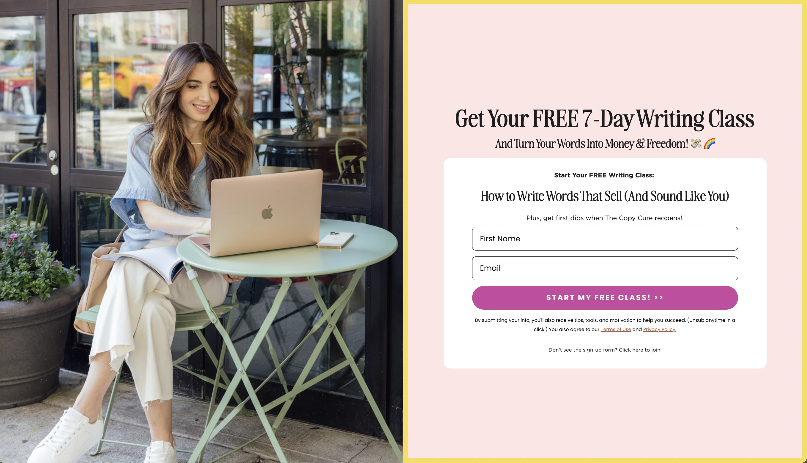
The Hero Offer Template: Big bold headline at the top with a subheadline adding context or urgency, a short bullet list of what the visitor gets, the opt-in form, and the CTA button. To gain the user's trust, add a small line like "No spam, unsubscribe anytime" at the bottom.
The Mockup + Form Template: A visual representation of the lead magnet (an ebook cover, a template screenshot, a course thumbnail) sitting on the left side. The headline and form are on the right. This layout works especially well when the offer is a tangible digital asset like a guide, toolkit, or workbook.
Both templates share one key similarity: every element is needed to get the visitor to act.
Industry-Specific Samples
The best squeeze pages revolve around specific audience’s needs. Check out these real-world samples for clarity:
- E-commerce: "Get 15% off your first order! Drop your email below." A simple, immediate, and impactful example that works especially well when tied to an exit-intent trigger or a timed pop-up.
- Online coaching or consulting: "Download the free 7-day plan to [specific result]." It promises specific results and defined timeframe, so that the audience knows exactly what they are signing up for.
- SaaS or tech products: "Get early access + a free onboarding checklist." It combines FOMO with practical value and works well for product launches and beta sign-ups.
- Content creators and bloggers: "Join 12,000 readers and get the weekly digest every Sunday." Social proof is paired with the CTA.
Before and After Comparisons
One of the fastest ways to understand what makes a squeeze page work is to compare a weak version with a strong one. Let’s compare these two examples to see the difference:
Before:
Headline — "Sign up for our newsletter"
CTA button — "Subscribe"
Form — "First name, last name, company name, and email"
After:
Headline — "Get the Free 30-Day Social Media Calendar"
CTA button — "Send Me the Calendar"
Form — Email only (The page shows a mockup of the download).
The after version converts much better. It gives the visitor a clear, specific reason to say yes and shows actual benefits of sharing their contact details.
Tools to Create Squeeze Pages
Free Page Builders
Nowadays, you do not need to hire a developer to create a high-converting squeeze page. There is a wide range of no-code and AI tools that let you design, publish, and manage one from scratch.
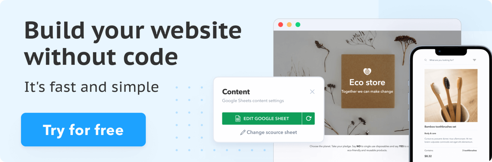
SpreadSimple (opens new window) is a user-friendly free solution for non-technical users who want to create a beautiful digital platform in no time. It uses a Google Sheet as your content database. In the website editor, you map the data to the corresponding website elements, customize the design, and add the necessary add-ons. To create a squeeze page, select the Universal Email Marketing Add-on, follow the instructions provided on its settings card to retrieve your API Key, customize the form (where and how it should be displayed), and select the CTA button color.
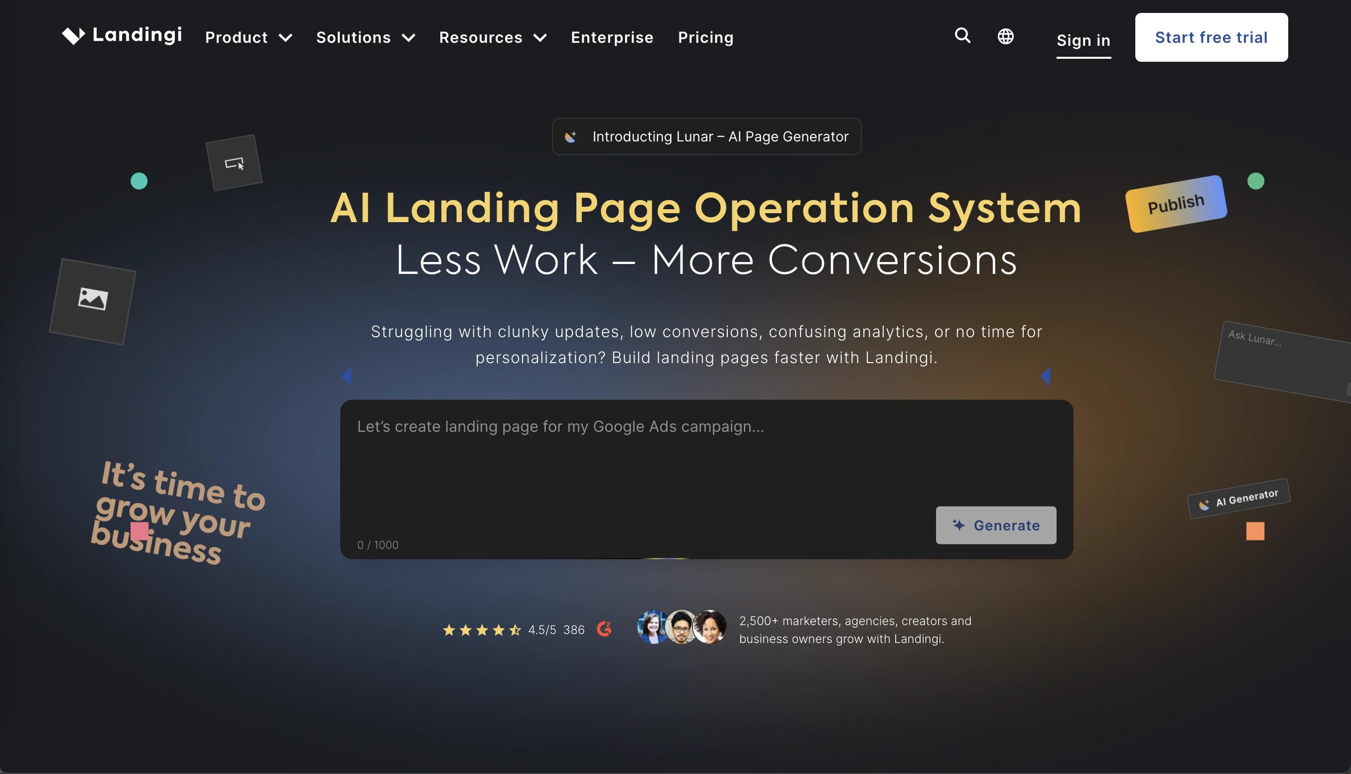
Landingi (opens new window) is another notable tool with a simple drag-and-drop interface, responsive design with a mobile view option, and customizable templates. To create a free squeeze page, users are required to sign up, select and personalize a template, optimize for mobile, connect their domain, and publish.
Mailchimp (opens new window) has a basic landing page builder included in its free plan. If you are already using Mailchimp for email, it is the easiest integration: sign-ups go directly into your list without any extra setup.
Email Marketing Integrations
Do not forget that a squeeze page is pointless if you do not use the collected user emails.
Most page builders integrate directly with the major email platforms: Hubspot (opens new window), SendFox (opens new window), MailerLite (opens new window), and more. The integration works simply: a visitor submits the form on your squeeze page, and they are automatically added to a specific list or sequence in your email tool.
From there, you can send a welcome email with the promised download, start them on a nurture sequence, or segment them for future targeted campaigns. The squeeze page is the main entrance, the follow-up email system should be not associated with annoying spam messages, but must present real value.
SpreadSimple supports integrations with multiple email marketing platforms, making it easy to connect your squeeze page to your existing workflow. Check the Add-ons tab in the SpreadSimple dashboard for the current list of supported integrations.
AI-Powered Generators
AI tools have made squeeze page creation faster than ever. Website builders now let you describe the offer and specific requirements in a few sentences, and the tool generates a full page layout. Since this work-scenario runs mostly in the same way for all the platforms, we are not going to highlight any specific names in this piece. When choosing an AI-builder, analyze its limitations, and which paid functions suit your company’s needs: is it complicated design, scalability, support, or anything else?
Conversion Optimization Tips
A/B Testing Strategies
Once the squeeze page is live, and traffic is noticeable, the next step is optimization. A/B testing by running two versions of the page simultaneously and measuring which converts better is the most reliable way to assess the situation.
The key rule of this analysis is to test one element at a time. Start with the elements that have the biggest impact on conversions:
- Does a benefit-focused headline outperform a problem-focused one?
- Which specific CTA phrase gets more clicks?
- Does asking for email-only outperform email plus first name?
- Does a checklist outperform a template image?
- Does a two-column layout outperform a single-column design?
Even small changes to the headline can significantly increase conversion rate.
Reducing Friction in Forms
Friction is any obstacle making the form completion process hard or annoying. The ultimate goal is to eliminate as much of it as possible.
The biggest friction points causing squeeze page abandonment are:
- Too many fields;
- Unclear privacy policy;
- Slow page load;
- Confusing form labels;
- No confirmation message.
A friction-free form starts the relationship with the potential customer on the right foot. A smooth, respectful experience highlights the quality of a client-oriented business, which is always a benefit for your brand image.
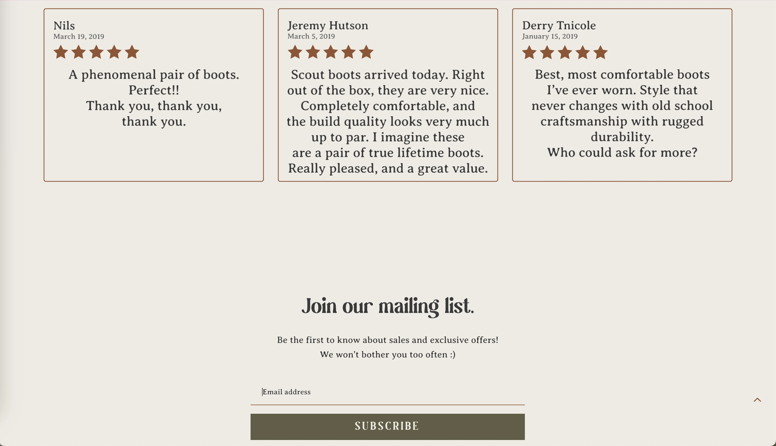
Trust Signals and Social Proof
Visitors who land on a new squeeze page do not know whether it is an eligible platform. It takes time to prove integrity. In this case, trust signals become the shortcut to reassurance. They answer the unspoken question: "Should I actually give this person my email?"
The most effective trust signals for squeeze pages:
- Subscriber count. It tells visitors that others found this worth signing up for
- Testimonials or quotes. A short sentence from a real customer adds enormous credibility
- Press mentions or logos. Being reviewed in a famous magazine or on a global platform adds authority.
- A clear privacy statement. A simple reassurance that you won’t be flooding the user with spam messages reduces hesitation.
- Your photo and name. A real face and name makes the page feel human, thus more customers will relate.
Simply put, the goal is to make the visitor feel that handing over their email is a safe decision they won’t regret later.
Common Mistakes to Avoid
Too Many Distractions
A cluttered, chaotic layout is the single most common mistake on squeeze pages. Every extra element gives the visitor a reason to click somewhere that is not the opt-in form. The space becomes a normal web page instead of a conversion tool.
Weak Value Proposition
Your value proposition is the answer to the question every visitor is silently asking: "What is in it for me?" If your squeeze page doesn’t answer it quickly and convincingly, the visitor loses interest.
Poor Mobile Experience
This is a universal factor for any modern website, not just for the specific case reviewed in this article. A page that does not load correctly on mobile is losing more than half its potential opt-ins.
Conclusion: Building Your Squeeze Page
Thanks to its brilliant simplicity, a squeeze page is one of the most focused and effective tools in digital marketing. Done right, it turns casual visitors into an engaged audience interested in your product or service.
Follow this clear formula: a compelling headline, a specific and valuable lead magnet, a short opt-in form, and a CTA that speaks the visitor's language. Add clean design, mobile responsiveness, and at least one trust signal. Tools like SpreadSimple make it possible to go from idea to live page in a single afternoon. Start with a functional minimalist version, get it in front of real traffic, and upgrade from there.