A well-suited font is doing more work on your website than you probably realize. Before a visitor reads a single word of your content, your font has already told them whether the business behind the page is playful or serious, cheap or premium, trustworthy or forgettable. Choosing the right typeface isn't a cosmetic decision but an important communication strategy. This guide explains what actually makes a font web-ready, which typefaces are worth using right now, how to pair them without a design degree, and how to get them running smoothly on your site without affecting its performance.
The Basics: What Makes a Font Great for the Web?
Readability, Legibility, and Core Typography Elements
Readability and legibility are essential features to consider when choosing a font. Legibility is about the letterforms themselves. It defines whether people can distinguish individual characters and tell them apart. Readability is about the whole block of text, including line height, letter spacing, and paragraph width. Combined, these factors determine whether a visitor comfortably makes it to the end of a paragraph or gives up halfway through.
A few key elements matter most when selecting a font for the web:
- x-height is the vertical distance between the baseline and the mean line (or midline) of lowercase letters.
- Letter spacing is self-explanatory. Letters that are too tight blur together at small sizes. On the contrary, if letters are too loose, words start falling apart visually, forcing the eye to work harder.
- Line height (leading) is measured from the baseline of one line of text to the baseline of the next line. A minimum baseline for body text is 1.4 – 1.6 times the font size. When it is too tight, lines feel cramped; loose line height causes paragraphs to lose their sense of grouping.
- Contrast is the difference between thick and thin strokes in a letterform. High-contrast fonts look elegant in large headlines but can hurt readability in small body text, while thin strokes risk disappearing on lower-quality screens.
- Character width dictates how much horizontal space a single character occupies within a font.
If a font fails at any of these on a small screen, it doesn't matter how stylish it looks in a polished mockup. Visitors simply won't stick around long enough to read it. This is why professional designers always test typography on the smallest screen a digital platform is likely to be viewed on.
Web-Safe Fonts vs. Modern Web Fonts
A decade or two ago, web designers were stuck with a limited number of safe fonts like Arial, Verdana, Georgia, Times New Roman, pre-installed on almost any computer, so the page would render consistently no matter whose device opened it. They were reliable, but visually generic, and as a result, an enormous share of the early web ended up looking nearly identical.
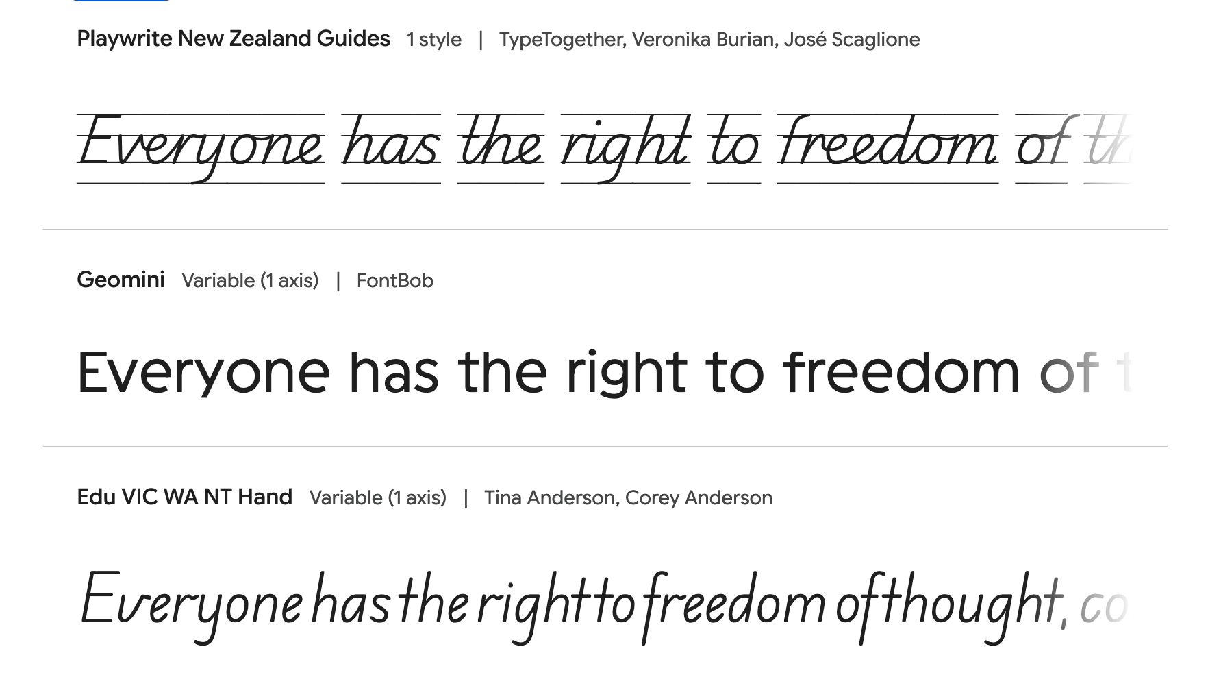
Modern web typography changed that entirely. Services like Google Fonts (opens new window), Adobe Fonts, and Fontshare let users load practically any typeface directly into a browser through a small snippet of code, so the site can look distinct and on-brand without asking a single visitor to install anything locally. The trade-off is performance: every font file is an extra resource the browser has to fetch before it can paint text on screen, so an ambitious modern typeface needs to be paired with a sensible technical setup.
Cross-Device and Browser Compatibility
A font that looks stunning on your designer's high-resolution monitor can turn blurry, oddly spaced, or even substituted with a fallback font on an older phone or laptop. Before locking in a typeface for a client or business site, it's worth checking it across:
- Desktop and mobile browsers (Chrome, Safari, Firefox, Edge), since each renders font smoothing slightly differently;
- Both light and dark backgrounds, where thin fonts tend to lose contrast;
- Small viewport widths, where line breaks, word wrapping, and hyphenation all behave differently than on a wide desktop layout;
- Slow network conditions, to see how the page looks for the second or two before a custom font finishes loading.
Most modern web type formats (WOFF2 in particular) are supported everywhere that matters today, so compatibility issues are not as common as they used to be. Still, always preview real content on an actual phone before publishing any text.
Top Font Examples for Modern Websites
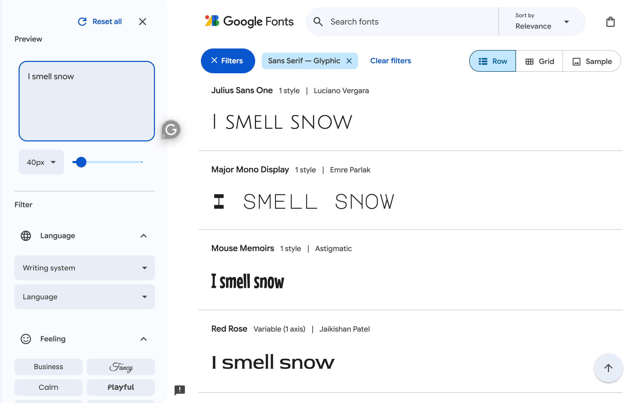
The Best Sans-Serif Fonts
Sans-serif fonts dominate the modern digital space because their clean, geometric shapes hold up at almost any size and on almost any screen resolution. A few standout typefaces worth knowing:
- Inter is designed specifically for user interfaces, with excellent legibility at small sizes and a huge range of weights. A go-to choice for SaaS products, dashboards, and anything data-heavy.
- Roboto is Google's flagship font, friendly and neutral enough to fit almost any modern website without arguing with the rest of the design.
- Poppins is geometric and rounded, extremely popular with startups and portfolio sites that are looking for a friendly, approachable, and slightly playful feel.
- DM Sans is a lower-contrast, versatile option that reads comfortably in both bold headlines and long stretches of body copy, which makes it a safe all-around pick.
The Best Serif Fonts
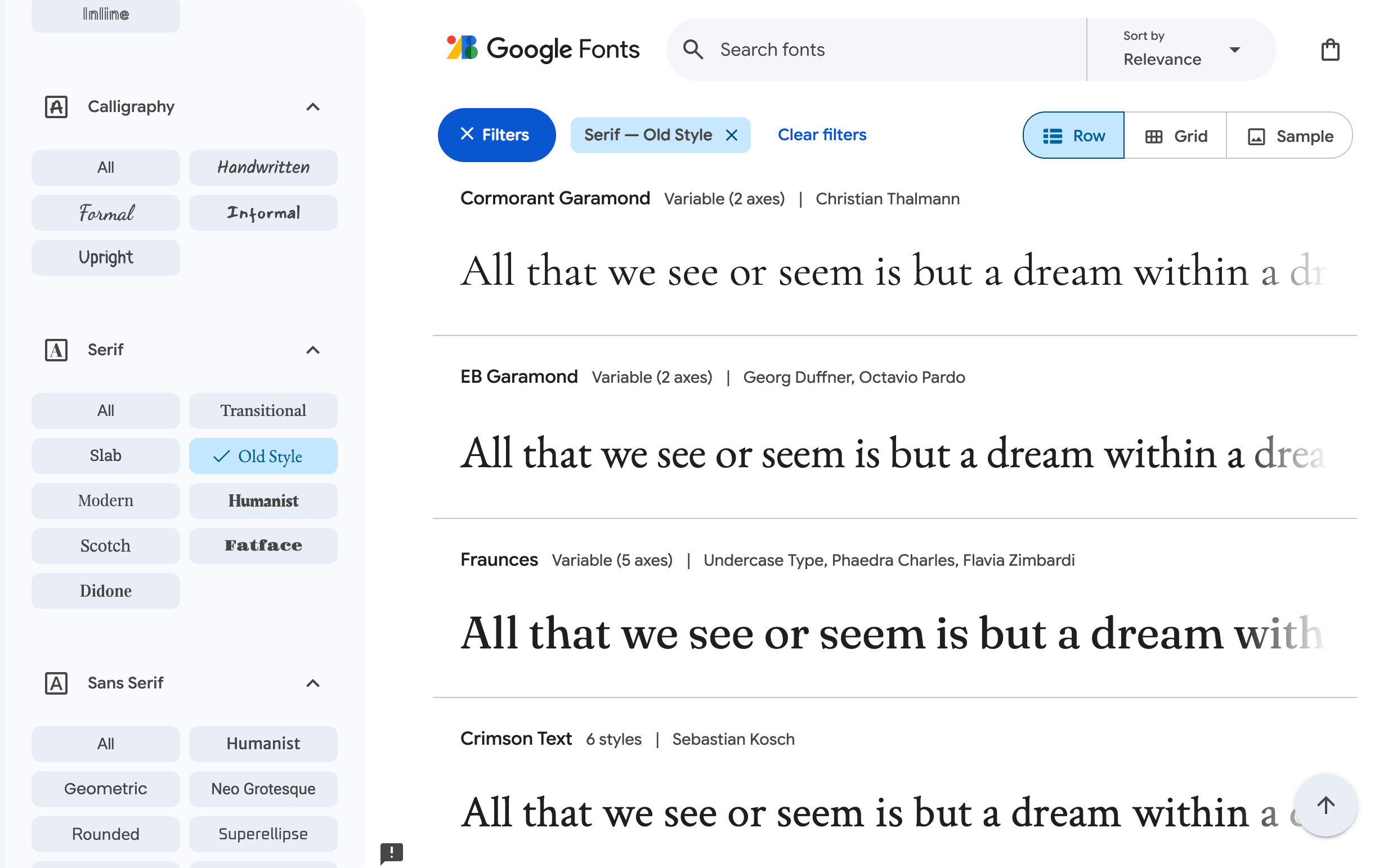
Serif fonts are typefaces distinguished by small decorative strokes, or "feet," at the ends of the main letter lines. Today's best web serif typefaces balance classic elegance with proportions built specifically for screens rather than print:
- Playfair Display is high-contrast and dramatic, ideal for large headlines on editorial sites, magazines, or premium and luxury-brand pages.
- Lora is a calmer, well-balanced serif with moderate contrast that works nicely for long-form articles, blogs, and anywhere an audience is expected to spend real time reading.
- Libre Franklin is closer to sans-serif but is built on classic Franklin Gothic proportions, giving it a professional, editorial tone that pairs comfortably with either style.
Unique and Display Fonts for Brand Differentiation
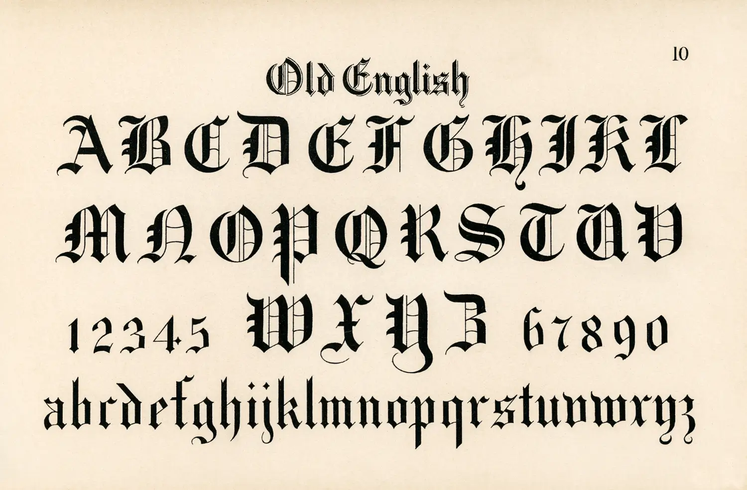
Once the website’s core typography is selected, a display or cursive typeface can highlight headlines, logos, or CTA sections. A flowing cursive script can make a bakery, florist, or wedding-planning business feel warm and personal, while a bold, geometric display font can make a tech brand feel confident and forward-looking. The rule of thumb: use these fonts sparingly, in large sizes only, and never for body text — cursive and heavily stylized display typefaces get exhausting, and often genuinely hard to read, once they're stretched across a full paragraph.
Serif, Sans-Serif, or Script: Choosing the Right Style

Understanding Brand Alignment and Tone
There's no ideal formula for every website — the best choice depends entirely on what your brand needs to communicate before anyone has read a single word:
- Serif fonts suggest heritage, authority, and editorial credibility. They are a natural fit for law firms, financial services, publications, and other established, professional businesses.
- Sans-serif fonts feel modern, clean, and efficient. They are the default choice for SaaS products, startups, e-commerce stores, and most contemporary websites in general.
- Script and cursive fonts feel personal and expressive. They are great as accents for weddings, beauty brands, or creative portfolios, but genuinely risky for anything that needs to read as strictly professional at a glance.
Ask yourself what a first-time visitor should feel within the first two seconds on your homepage: reassured, excited, inspired, or informed? That answer usually points straight to a style, and often to a specific short list of fonts within it.
Font Pairing: The Art of Combining Typefaces
Principles of Effective Pairing and Visual Hierarchy
Most well-designed websites use two typefaces, rarely three: one for headings, one for body text, and sometimes a third for accents, buttons, or navigation. To keep these pairings from feeling accidental or amateurish, follow these principles:
- Contrast, don't clash. Pair a bold, expressive display font for headlines with a plain, quiet font for body copy, so each one does its own job without competing for attention.
- Limit your styles. Two type families with two or three weights each is usually plenty for a full website. Stack on more than that, and a site starts feeling cluttered.
- Match the x-height and proportions. Typefaces with wildly different proportions can look mismatched side by side even when they're stylistically compatible in theory.
- Let hierarchy do the heavy lifting. Size, weight, color, and spacing create visual structure just as much as font choice does. A single well-chosen font family can carry an entire website if hierarchy is handled with care.
A well-tested combination for most business or portfolio sites is a confident sans-serif like Poppins or Inter for headings, paired with a highly readable serif like Lora for body paragraphs. This duo reads as both modern and trustworthy.
Recommended Font Pairing Tools and Resources
You don't have to guess your way through pairing. There are several reliable resources that make the process convenient:
- Google Fonts allow users to browse by category, filter by style, and preview real pairings directly inside the interface before committing to anything.
- Fontpair provides a library of curated combinations built specifically around Google Fonts, organized by mood and use case.
- Fontjoy is an algorithm-based tool that suggests pairings automatically and lets you shuffle through fresh alternatives instantly if the first suggestion doesn't fit.
How to Implement Your Chosen Fonts
Adding and Optimizing Web Fonts on Your Site
Once you've picked your fonts, performance matters just as much as looks, since a slow-loading page will cost you visitors regardless of how good the typography is. A few practical steps worth following:
- Limit font weights. Loading eight weights of the same family when your design only uses two is wasted bandwidth on every single page load.
- Use font-display: swap in your CSS so text stays visible in a fallback font while the custom one loads, instead of leaving a blank screen for visitors on a slow connection.
- Preload critical fonts used in above-the-fold headings so they render as fast as possible.
- Serve WOFF2 wherever possible — it compresses smaller and loads noticeably faster than older font formats like TTF or OTF.
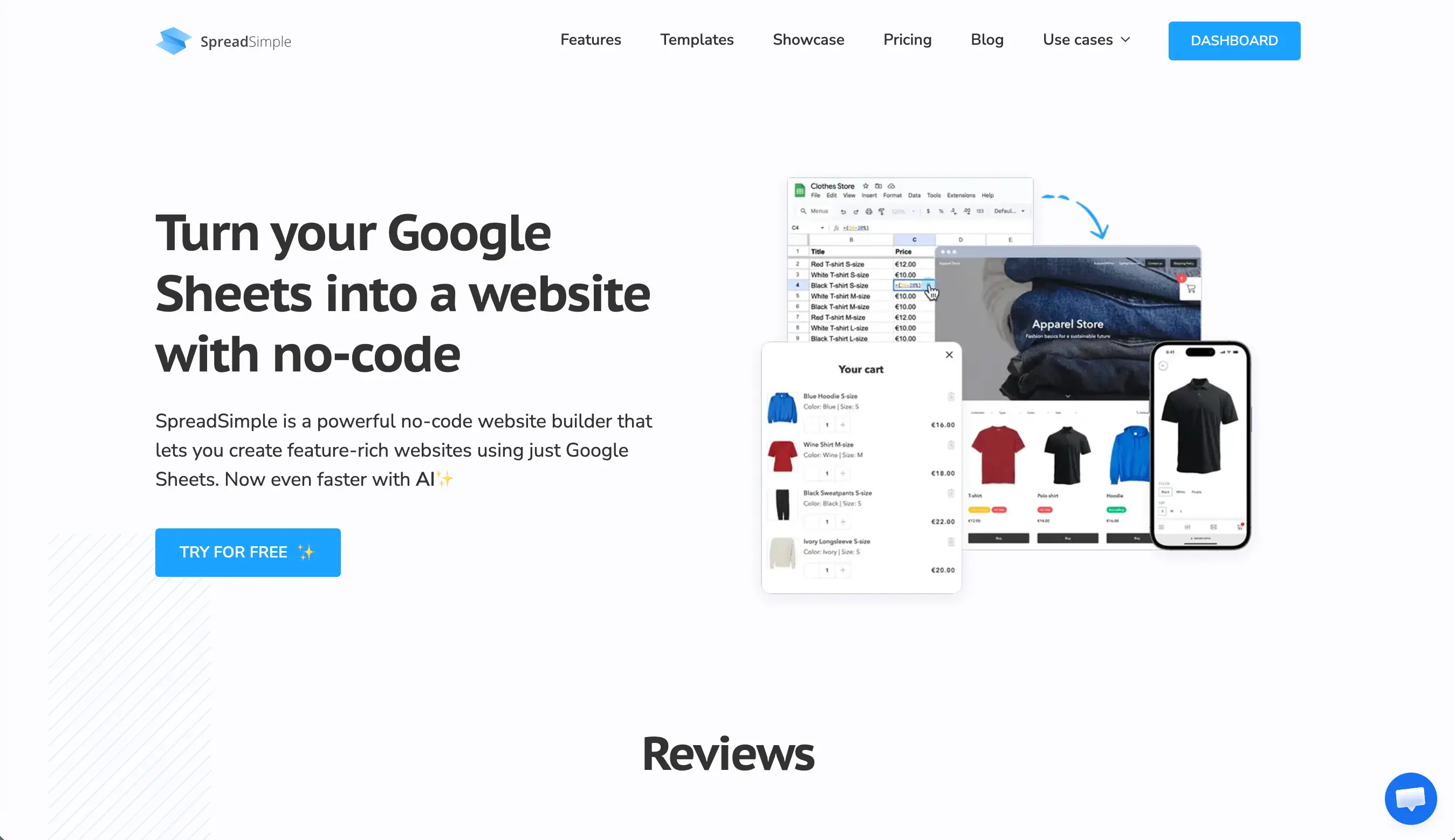
If you'd rather skip the CSS entirely, plenty of no-code builders handle this work for you automatically. On SpreadSimple, for instance, you pick your fonts directly from the Design tab, and the platform takes care of loading and optimizing them behind the scenes. This workflow is genuinely useful if you're running a business catalog or portfolio through Google Sheets and would rather spend your time on content than on a stylesheet.
Font Licensing and Copyright Considerations
Not every attractive typeface is free to use commercially, and this is where a lot of small business owners get caught out. Before deploying a typeface on a business or client website, check a few things:
- Confirm the license explicitly covers web embedding, not just desktop or print use. These rights are often licensed and priced separately by type foundries.
- Free doesn't always mean unrestricted: some "free for personal use" fonts quietly require a paid commercial license the moment they end up on a business website.
- Google Fonts and Fontshare's open-source catalogs are generally safe for commercial use, but it's still worth reading the specific license file attached to each font, since terms vary from typeface to typeface.
- For a professional portfolio or storefront, spending a few extra minutes confirming licensing is far cheaper than dealing with a takedown notice or legal complaint after launch.
Conclusion
Good web typography is largely invisible in the best possible way. Visitors don't consciously notice a well-chosen font, they simply find the site easy to read and end up trusting it a little more. Start with readability, pick a style that genuinely matches your brand's tone, pair no more than two or three font families with real intention, and make sure your technical setup doesn't slow anything down along the way. Get those fundamentals right, and your fonts will do quiet, effective work on every single page of your website, long after visitors have stopped noticing them consciously.
For more information on website creation and the latest web design trends, check out our previous posts:
Best Web Design Trends 2026 That Actually Work
Best Storytelling Website Examples: Web Designs to Inspire Your Next Project